Mobile apps have grown at an astronomical pace in the past few years. According to the latest Statista report, there are approximately 2.8 million apps in the Google Play Store and 2.2 million in the Apple App Store!
In 2020, mobile apps are projected to generate $188.9 billion U.S. dollars in revenue via app store purchases and in-app advertising.
New mobile app startups like COFE, a mobile coffee marketplace, and Zum, an app for child transportation, are popping up every day and raising millions in venture funding capital.
But in such a crowded market, how does a first-time founder develop a mobile app that wows users (and investors)?
What separates successful apps from unsuccessful apps is a seamless mobile user experience, or mobile UX.
Here are the 7 biggest mistakes first-time founders need to avoid when designing their app’s user experience.
Mistake #1: Not Understanding Your Users’ Needs
Understanding your users is the foundation for building any great product, mobile apps included.
Before you rush into designing your app, you need to understand your audience and be able to answer these questions—which will require some research:
- What features and benefits would provide the most value to our user base?
- What pain points or problems does our product solve?
- What makes our solution better than the competition?
- What sort of interface is critical for providing a great mobile user experience?
Designing your mobile app UX is an iterative process that may change over time as you conduct research and receive customer feedback.
A common framework that founders use is the User-Centered Design (UCD) approach, which focuses on the users and their needs in each phase of the design process, rather than after the fact.
Here’s a flowchart of the User-Centered Design approach:
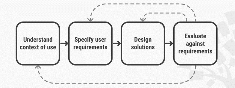
Source: https://www.interaction-design.org/literature/topics/user-centered-design
Simply put, proper customer research and an iterative approach will help you understand who your users are and what they need, and then adapt your design accordingly. The goal is to create an experience that truly resonates with your users.
Mistake #2: Trying To Incorporate Too Many Features
When founders develop a mobile app for the first time, they’re tempted to throw in every cool feature they can think of.
Unfortunately, this rarely translates into a good user experience.
First off, having too many features will overwhelm your users and make them ditch your app. Second, when you’re first launching, you want to focus on refining your core user experience instead of rolling out a bunch of poorly developed features.
What core features do you need in order to launch? A shopping cart? Photo editing filters? Prioritize those.
Then, analyze which features of your app are used the most and focus your efforts on making those experiences even more engaging and intuitive. Additional features can always be added in future releases.
To illustrate, let’s take a look at Lyft.
Lyft’s mobile UX designers have mastered the art of prioritizing features and continually refining the user experience around its core functionality: getting a ride. In 2018, they rolled out a different user experience that enabled users to see nearby drivers, wait times and costs, making it easier for users to order a ride.
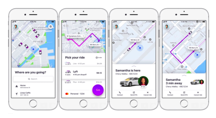 Source: https://techcrunch.com/2017/11/08/lyft-is-testing-a-new-rider-experience-with-a-small-percentage-of-users/
To sum up: When designing your app, keep it simple. Prioritize the features that are critical to a good user experience, and continually refine them.
Mistake #3: Using Jargon That Your Customers Don’t Understand
You want to speak the same language as your users. Esoteric terms and phrases lead to a poor user experience. Calls to action that use brand-specific jargon won’t inspire anyone to action—they’ll just create confusion.
In general, simple, direct communication provides clarity instead of confusion, so make the interaction comfortable by using accessible words and phrases. Avoid acronyms, brand-specific terms, cultural axioms and technical terminology that people might not understand.
Here’s an example from Think With Google:
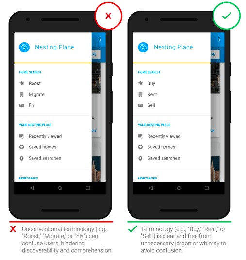 Source: https://www.thinkwithgoogle.com/marketing-resources/experience-design/chapter-6-usability-and-comprehension/
As you can see, the design on the left uses the terms “Roost,” “Migrate” and “Fly,” which are brand-specific and unclear. A user’s not likely to go further. On the other hand, “Buy,” “Rent” and “Sell” are familiar words that a user will immediately understand.
Mistake #4: Cluttering Up The User Interface
Another big mistake first-time founders make is cluttering up the design with buttons, images, videos, text, etc. Such visual overload can make the app feel too complicated, again resulting in a poor user experience.
Removing visual clutter and striving for a minimalism is a better approach. Just as you prioritized your core app features, you need to focus on the visual content that’s valuable for your user and remove unnecessary elements that don’t meet your user’s end goal.
Try to design each screen with one primary call to action:
 Source: https://uxplanet.org/call-for-attention-ui-design-tips-on-cta-buttons-5239413aded2
As you can see above, the “Follow” button is the primary call to action on the user’s screen; there are no other buttons that might distract or confuse.
As a general rule, “remove irrelevant information (noise) and prioritize relevant information (signal) by putting content first and elaborating clear visual language.”
Mistake #5: Neglecting The First-Time Experience
The first-time experience is one of the most important components of the mobile UX. Without a pleasant onboarding experience, users are likely to never come back. In fact, research by Localytics shows that 21% of users (a little less than 1 in 4) never return to an app after the first use.
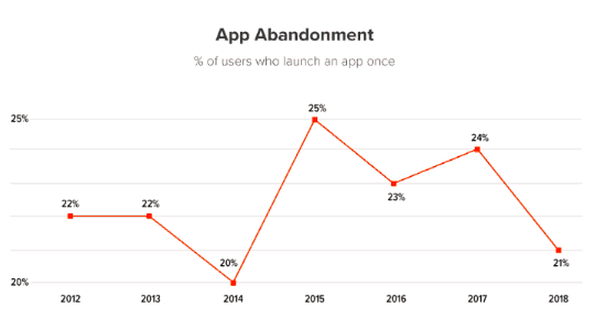
Source: http://info.localytics.com/blog/21-percent-of-users-abandon-apps-after-one-use
This means it’s critical to make a good first impression.
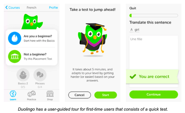
According to UX Planet, one of the most effective onboarding strategies is contextual onboarding. Unlike up-front tutorials that deluge new users with information all at once, contextual onboarding offers instructions only when the user needs them.
Duolingo, a language learning app with millions of users, is a great example of contextual onboarding:
Source: https://www.smashingmagazine.com/2018/02/comprehensive-guide-to-mobile-app-design/
After signing up, users are guided to choose between “beginner” and “not a beginner.” Then the app takes users to its core product almost immediately, progressively revealing how the app works. Users are encouraged to jump in and do a quick test before proceeding.
Duolingo’s onboarding journey allows the customer to get a true sense of the app’s value; for that reason, they are much more likely to come back.
There are many other strategies that you can use to design a great first-time experience, but the important thing to remember is that you need to guide the user (without overwhelming them) and help them achieve their goal. After all, that’s why they downloaded your app!
Mistake #6: Designing Poor Navigation
Even if you design the best onboarding experience, it’ll be useless if your customers have a hard time finding features or navigating your app.
When someone starts using your app, they should be able to easily figure out where to go and how to get there.
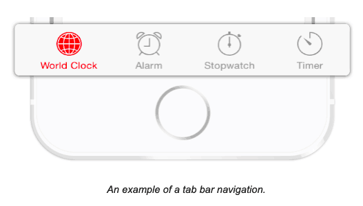
Part of designing intuitive navigation is determining which type of navigation to use. Hamburger menu? Tab bar? Responsive multi-level navigation?
Source: https://theblog.adobe.com/basic-patterns-of-mobile-navigation/
Ask yourself: Which type of navigation is most intuitive and familiar to my users?
The navigation should be smoothly integrated into the structure of the app, rather than drawing focus away from the content. The user should also be able to tell where they are in their user journey so that they can easily navigate to where they want to go. Lastly, always strive for consistency. Don’t move navigation controls from one screen to another! This will only confuse and disorient your users.
Helping users navigate should be a top priority for every mobile app. After all, even well-crafted features or the most compelling content is useless if people can’t find it.
Mistake #7: Not Testing Your Designs With Real Users
Always be testing.
That’s true for almost anything, but especially mobile UX. Even the most well-designed apps may have some unforeseen flaws or bugs when put to the test in the real world.
Even if you’ve met all the user requirements in the development phase, does your app actually deliver the intended results? Can users reach their end goal without any hiccups or confusion?
User Acceptance Testing (UAT) can help you capture the user experience and ensure your app both looks good and works great. Ask real users to complete specific tasks in your app—if they get lost, you may need to make changes.
Even after launch, you should continue to measure your app performance so that your mobile UX can evolve to better meet your customer’s needs.
Wrapping Things Up
Mobile UX is a critical component of success for first-time founders. In this booming app market, you need to work even harder to meet user expectations and make your app useful, relevant and valuable.
Avoiding these 7 big mistakes will help you design a mobile experience that resonates with your users. You may not get it right the first time, but with continual improvements, a focus on your core features, and the right onboarding, you’ll be well on your way.
What mistakes do you find most first-time founders make? Share in the comments below!