
The market of ecommerce app development is ever expanding. In fact, the growing demand among users has forced even small businesses to make an app part of their offering.
Not only do users prefer apps to mobile sites, but statistics also show conversion rates are three times higher in apps than on the mobile web, with over 67 percent of sales happening in-app. But that’s not all. Another study found that mobile app users spend twice as much time shopping as website users do.
But despite the increased consumer demand for mobile apps, ecommerce companies that offer apps still battle low engagement and retention, stifling their growth.
Why’s that?
The main problem: a poor app plan and design.
We asked 8 mobile experts about this pervasive problem, and they shared with us what they feel are the biggest mistakes in ecommerce app design—plus valuable tips for avoiding those mobile app mistakes.
Let’s dive in:
Ecommerce App Development: What Experts Say Is Missing in The Planning & Designing Stage
With people becoming increasingly attached to their mobile devices, it should come as no surprise that the number of hours spent in ecommerce apps is at an all-time high. It only makes sense for companies to create a mobile app for their customers; however, having an app is one thing—getting people to use it is another.
If you want people to use your app, then the user experience has to be memorable. And that requires careful planning and intentional design.
Let’s look at mistakes that can come in the way of your app’s growth:
Mistake #1: Design for web, not mobile
“One of the biggest and most consistent mobile mistakes I see is to not respect the medium. In other words, products that either are moving from a web to mobile presence or have both platforms to support, often treat the mobile version like it is just the web in a smaller screen.
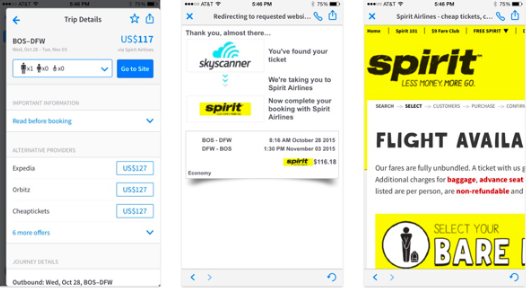
“This really limits your ability to build an engaging mobile experience and can lead to unnecessary trade-offs, which are only a consequence of trying to fit all the same functionality, in the same way, in a mobile screen size. Many travel apps, like [those of] the big airlines, often run into this problem, squeezing the exact same fields into a smaller space, or creating ecommerce funnels that are not ideal from a mobile perspective. Apps like Kayak or Skyscanner push you to another airline’s website where you are either now dealing with a page designed for the desktop computer [or], in the worst cases, [are required] to pinch and zoom.
“Really building for the medium is about understanding the unique mobile use case, how it differs from others (like the web), and creating a simple, focused feature set and experience to address it. It requires you to step back from what you think you know and really approach mobile with fresh eyes.
“There are some great example of mobile first-experiences, from products that don’t even have a web presence. Always loved how differently DuoLingo created a really focused mobile product, making tough decisions to leave functionality out of the mobile product from the web product. Or Hopper’s mobile booking flow, [through] which you can book a flight in 4 taps on your mobile device, as compared to other mobile flight booking tools.” —Pantelis Korovilas, head of design at Hopper
Mistake #2: No personalization
“The most obvious mistakes I see companies make with their ecommerce apps is lack of personalization and relevant engagement. Facebook and Instagram ads along with an optimized mobile web experience have made it extremely easy to buy any product on demand with no need to download an app, which means that people need real incentive to download an app and use it on a frequent basis.
“One of the strongest incentives for downloading an app is that it is catered to you as an individual:
- Remembers your previous searches
- Saves your purchases
- Suggests similar products that suit your shopping history
- Offers easy navigation and checkout
“All these are imperative for a high-converting ecommerce experience that encourages people to come back and keep purchasing. In-app experiences aren’t enough. Highly personalized mobile notifications and emails are imperative for increasing engagement, forming a connection with the user and creating loyal customers. Unfortunately, most notifications and emails I’ve seen are very product/sales focused and lack a sense of relationship between the brand and the customer.” —Talia Wolf, conversion optimization expert
Mistake #3: Low-quality product images
“One of the biggest mistakes ecommerce companies make is not investing in quality photo shoots. With mobile apps, real estate is limited, hence product photos have a huge impact on the overall user experience your customer will have with your product and brand.
“A good user experience means higher conversions. To ensure a good user experience, product photos for mobile ecommerce apps should ideally be large, clear, on a white background, in multiple angles and include a zoom feature. In my experience, I have seen that supplementing product photos with creative photos of the actual product in use, increases conversion.
“Customer-centric design, intuitive UI, easy navigation, and faster checkouts are some checkboxes that need to be ticked to ensure success while designing for mobile ecommerce apps.” —Lyle Rebello, UI/ UX designer
Mistake #4: Barriers to browsing and buying
“Poorly designed features are the most common mistakes in ecommerce. A few features that need attention in most ecommerce apps are:
- Signup walls (or lack of guest checkout): You can’t purchase a product without creating an account. This is a huge problem for many apps.
- A limited number of payment options: In many cases, you can’t purchase a product using PayPal for instance.
- Typing shipping and billing information twice during checkout: It increases interaction cost.
- Using infinite scrolling rather than pagination on the product list results page: As a user, you can’t save a current position in the scroll to continue the journey on another device (for example, you can’t switch from mobile to desktop to continue a journey).” —Nick Babich, UX expert
Mistake #5: Difficult checkout process
“When it comes to the checkout experience, one rule reigns supreme: Make it easy. Your main goals here are to reduce friction, assuage doubt, and reassure the customer that they’re making a great choice.
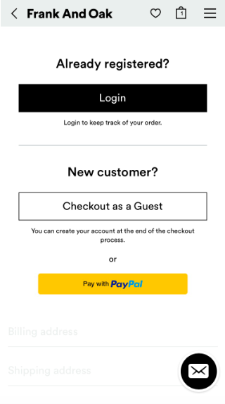
- The biggest mistake you can make is not allowing guest checkout. Yes, you want to register new users. Yes, you want to be able to send them nurturing emails (don’t you??). But imagine you’re a customer who just wants to buy the dang thing. In that case, being asked to create an account is often an insurmountable roadblock. And there’s no coming back from that. #byefelicia
“Here’s Frank And Oak generously allowing me to check out as a guest right away:
“In the same vein, DON’T serve up form field error messages that don’t clearly explain what went wrong and how to fix it—otherwise, you’re creating frustration and likely killing conversions. Here’s an example of a straightforward checkout form field error message from Anthropologie:
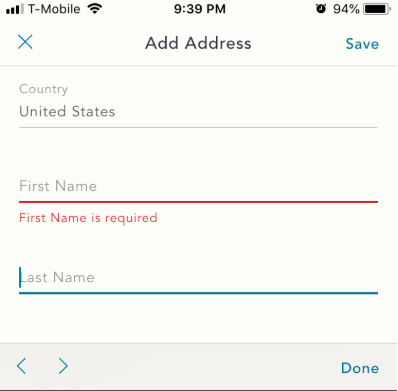
“(Could this have been better? IMO, yes. Something like, ‘Please enter your first name’ is more direct and action-oriented. Something like, ‘We need your first name so your neighbors don’t steal your delivery’ would have been an even more specific, empathy-inducing way to address this error.)
- DON’T hide what’s in the customer’s cart – Make sure people can see what they’re buying. Now, you don’t want to link directly to products (to reduce clicks away from checkout), but DO allow users to change the quantity of each item right there inside the checkout.
- DON’T show your entire checkout process all at once – Whether you’re creating a browser or in-app checkout, only show the user what they need to see at the time. Roll up everything else, and/or auto-expand the next step when they get there.
- Last but not least … Another huge mistake? Not automatically correcting/parsing numerical information. Someone at Business of Software this year said, ‘It takes one line of code to remove the hyphens from a phone number, and 10 lines to serve an error message that says “Remove hyphens.”’ If your checkout can’t put information into the right format, you’re adding friction. And friction kills sales.” —Lianna Patch, conversion copywriter
Mistake #6: Key functions out of thumb’s reach
“Another common mistake, as phones get bigger, is to put key functionality, or key steps in the funnel, out of thumb’s reach. Phones increasingly are being manipulated with one hand and larger screens mean harder access to areas further out of thumb range. Scott Hurff has a great write-up about this here:
“One common example of this is search bars. The common mobile pattern of having them up at the top of the screen is used on everything from Safari, to Instagram, to Uber and Pinterest.
“But we’re seeing improvements here. The new iOS operating system has been leaning in on large titles, which have the benefit of bringing search down closer to the thumb for most apps. Lyft recently did a great redesign where they really emphasized this and made it thumb-accessible. Which makes so much sense given it is the launch point into their primary ecommerce funnel.” —Pantelis Korovilas, head of design at Hopper
Mistake #7: Ineffective search feature
“Pay special attention to your search feature—its impact on conversions is often underestimated. Is it actually helping users find the product they are looking for? Does it enable users to discover new products that might interest them? Is the ‘auto-fill’ working correctly? What gets measured, gets managed. I’m a big believer in using qualitative analytics so that you can actually visualize how users behave with the feature and pinpoint where it needs improvement.” —Hannah Levenson, head of inbound at Appsee
Mistake #8: Lack of intuitiveness
“One of the biggest mobile app mistakes made today is having a lack of intuitiveness. The appeal of mobile and smartphone technology is that it doesn’t need to come with instructions. I have personally witnessed a two-year-old figuring their way around a smartphone. Your mobile app needs to remain consistent with the mobile philosophy of simplicity. Any action that you would like your users to take should be easily taken with a few swipes or clicks, even if it is the users first time on the app. To put it simply, you have to make your app so easy to use, that at least one action can be taken by a two-year-old randomly pressing call to actions. If it is too complex from the outset, then your user may never come back.” —Jimmy Rodriguez, COO at 3dcart.com
In Conclusion
The key to mobile app growth is straightforward: Create an app experience that’s difficult to forget and build a marketing strategy to match. To do so, your ecommerce business must continually adapt to the changing needs of your customers. The tips shared by our experts above will help you avoid costly mistakes and build an app your audience will love to use.
Thinking of building an ecommerce app for your company? Our team of product strategists are here to turn your idea into a viable app. Schedule a free meeting now!