Words are powerful.
Words are used to convey thought, feeling, meaning and ideas.
And while words help us better tell a story, they are not only useful in books and blog posts.
Words are also an effective way of conveying purpose and clarity to your audience. Strong, intentional written words ultimately support a user’s experience, and that’s exactly what I want to talk to you about today: UX writing.
What is UX writing?
UX writing is the combination of UX methodology and copywriting skills and can inform every word in your app, website, landing page, etc. Words are crafted with intent, backed by research, and verified through testing. This may sound daunting but it doesn’t have to be at first.
The words you use in your product can determine its success or failure. We live in a world full of distractions and are constantly inundated with the internet’s firehose of information. To rise above the background noise, we have to craft our words strategically to boost the effectiveness of our communication with our users, or else there is nothing to focus on.
The good news: UX writing guidelines will make your product, user experience, and conversion rates better and the basics are easy to grasp.
Why don’t users just read all the copy?
Unfortunately, users rarely read every word on a screen.
In digital products, skimming is the norm. You’re likely skimming this right now. Slow down.
See what I did there?
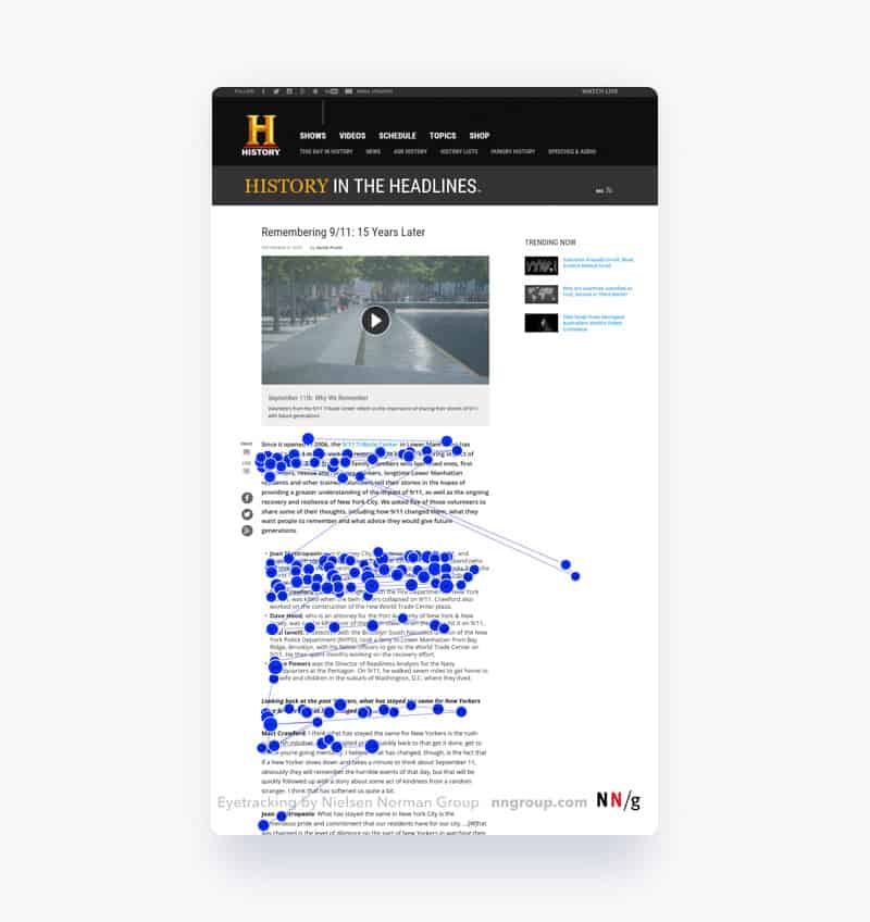
It’s common knowledge in UX circles that users will likely follow the F-shaped skimming pattern, pictured below, where they read maybe the first sentence or two in a paragraph and start skimming through to the next paragraph.
The purpose of UX writing is to disrupt skimming patterns and provide the user with the most important information so they can have a successful interaction with your product.

Source (Provided by the NNG)
So how do you accomplish such a task? I have a handy list of do’s and don’ts that will give you a head start.
Do’s of UX writing:
Pay special attention to the first 11 characters (approx. 2 words)
Research has found that often users will only read the first two words of a paragraph, link, or instruction. Fill this space with the most important words because that may be all they read before continuing, e.g. Instead of saying, “Please make sure you read instructions before you begin”, say “Read instructions before you begin, please”
Use consistent language
It’s best not to be original when you are striving for effective communication. Instead of looking for thesaurus.com, choose your language carefully and stick to it. Familiarity breeds comfort and confidence. For example, consider the following pairs: “Remove vs Delete”, “Continue vs Next”
Be concise
Shorten your copy as much as you can without sacrificing context. Make sure every word of your copy is important to the user and worth their time.

“Vigorous writing is concise. A sentence should contain no unnecessary words, a paragraph no unnecessary sentences, for the same reason that a drawing should have no unnecessary lines and a machine no unnecessary parts. This requires not that the writer make all sentences short, or avoid all detail and treat subjects only in outline, but that every word tell.”
-Strunk and White, The Elements of Style
Provide all necessary information to the user
While we should strive to be as concise as possible, you still need to make sure you’re not sacrificing important information that the user needs to know. For example, a traffic sign that just says “Slow” is better than nothing, but it doesn’t give the user any information on what is going on and is more likely to be ignored. A better sign would be “Slow – Rough Roads Ahead”. This way, the user is informed of the risk and can act accordingly.
Bold the most important words
Bolding words is a great way to disrupt a skimming pattern. If you need to make sure the user sees these words, try to flag down their attention. As well, this is also an excellent tactic to use in emails.
Anticipate the user’s needs
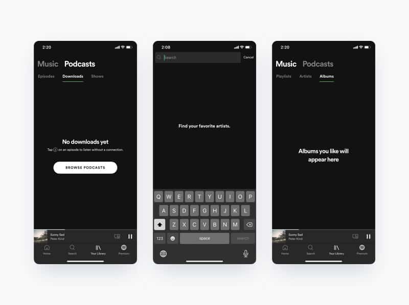
When you are writing for a product, it’s best to think of it as a one-sided conversation. You have to anticipate what the user would ask in each scenario and provide that information. For an empty state, you could leave the screen blank, but that would result in users guessing what to do next. Instead, it’s more helpful to say: “Here’s how you get started”.

Be mindful of the brand’s voice and tone
The personality of the brand and the context of the message should be taken into account when forming your copy. Even a bubbly, irreverent brand voice should be serious and sincere in the right situation. It’s important to be aware of what the user is feeling; whether it’s disappointed, alarmed, excited, or bored. These are each opportunities for the user to be comforted, reassured, celebrated, or engaged by your words.
Be accurate and honest when setting expectations
Unpredictability causes discomfort. Make sure that you set and meet your user’s expectations so they feel comfortable with your product. Links and buttons should prepare the user for what will happen next. For instance, if the button copy is “See our process”, don’t send the user to a subscription modal before directing them to the correct page.
Use active voice (unless using passive voice helps to front-load information)
Active voice is more engaging and usually easier to read. Use it as often as you can. For comparison, passive voice would be “this document can be edited by you” vs the Active voice: alternative, “you can edit this document”.
Don’t’s of UX writing
Don’t use jargon unless necessary
Most users, even experts, prefer plain language to specialized jargon. Keep your language simple and to the point. Most products should aim for an 8th grade reading level.The exception occurs when there is a shared common vocabulary, like in medicine or technical fields. In those circumstances, you should use the words your users would expect, even if that includes jargon. In most circumstances, users would prefer “arm bone”, but a doctor would expect you to write “radius”. “ulna”, or “humerus”.
“A common misconception is that Plain Language dumbs down content so that anyone can read and understand, ultimately catering to the least knowledgeable reader. In fact, this is far from the truth: Plain Language communicates information quickly and clearly, benefits everybody (as any usability or accessibility effort should), is easily scanned, and is preferred by everyone — even experts.”
-Rachael Renk, Plain Language for UX Writing
Don’t include articles (a, an, the) for instructions
When you’re trying to front load information and maximize retention, you don’t need to use articles. These articles slow down reading comprehension and are not necessary for brief instructions. A simple example being, “Change the Font” vs “Change Font”
Don’t use cutesy/trendy/made-up language
Made-up or cutesy language may suit your brand’s voice, but clarity is most important. Copy should be plain, understandable, and easy to read. Moreover, trendy language can also make your product look dated, quickly.
Don’t be generic or unhelpful
Vague words leave the user with little to go on and no reason to act. Avoid ambiguity like, “Learn More” or “Click Here”, instead write “Meet the Team” or “See Demo”
Don’t prioritize grammar over effectiveness
UX writing doesn’t always follow grammar rules perfectly; your product’s copy should read more like a conversation than a textbook. Using a colloquial approach creates an effective and engaging dialogue
Don’t use words for numbers
Numbers are much faster to read than words. They disrupt skimming patterns and are more memorable. So, in adhering to this tip, you would use “2” and not “two”
Don’t use superlative language
It’s a VERY bad idea to use superlatives. NEVER do such a thing. Seriously, it sews distrust and creates high expectations which can set the user up for disappointment. You can be confident about your product without extreme language. For instance, which sounds more trustworthy, “The best pizza in the world” or “Authentic, delicious pizza, the way you like it”?
Don’t use double negatives
They are hard to read and confuse the user. Make sure your copy is clearly stated. For the example below, do I want to cancel cancelling my workout?

Don’t use common introductory phrases
We’ve all been raised to be polite, but sometimes it’s best to get straight to the point. Introductory phrases can waste precious space and dilute the message. Use your own judgement, which of these is more clear “Would you like to Save or Delete?” vs “Save or Delete?” ?
Don’t blame the user
Even if they’ve made a mistake, error messages should be informative rather than punishing. Instead of writing “Invalid password”, use “Passwords must contain a capital and a lowercase letter”
Don’t write in ALL CAPS
Using all capital letters in your copy slows down reading comprehension by 33%. They can still be used sparingly, when the content isn’t the most important to read. As a rule of thumb, you can use all caps for subheadings and supplementary copy, but don’t use it for titles, buttons, or body copy.
The Takeaway
Write with purpose.
Centering your copy around the user’s experience is the first step towards good UX writing practice. There is a lot to learn about UX writing, which is an entire discipline unto itself, and I encourage you to dive deeper if this is something that interests you. By following these guidelines, you will be able to create engaging, informative products that increase the chances of a successful interaction with your user.


