On average, 11% of users uninstall apps because they are confusing and/or clunky.
Creating an intuitive and effective user experience is sometimes more difficult than it seems. Every user is unique, meaning that expectations and needs may vary from person to person.
It’s impossible for a single app owner to know all of the specifics about each potential user. However, this should only motivate them more to learn, analyze, and study the particular habits and interests of their users to create a successful product and improve user retention.
The best way to do this is to involve your users in the design process. This practice is referred to as participatory design.
Participatory design helps to create a product that is accessible and acknowledges pain points that other design techniques may ignore. To understand how this happens, let’s first understand what participatory design is.
What is Participatory Design?
Participatory design is exactly what it sounds like. It’s inviting and including the participation of others into design and development processes. This participation isn’t restricted to users, this can include founders, designers, developers, and other team members who have insight to share.
As described by Stanford University, the motivation behind participatory design is to encourage the active involvement of potential or current users of a system in the design and decision-making processes.
The health sector, in particular, presents unique challenges, opportunities, and barriers that should be considered when approaching the build of a health and wellness app. This means that recognizing the pain points of your target demographic is essential, especially where concerns may differ from other users.

Participatory design means being intentional about how your product is going to help your intended user. The most significant benefit, as noted by our team, is that by involving your users and recognizing their stake in the success of your app, you’re able to overcome potential blindspots and alleviate unconscious bias.
Users can get involved with the design in a variety of ways. This primarily takes shape in actively providing feedback and suggestions. In other cases, app owners can gather user feedback and back end data for information and inspiration. Below we have four instances of how we used both techniques to design successful user experiences and effective mHealth products.
What it Looks Like in Action
There are a variety of ways to implement this participatory design strategy into your mobile product. One approach involves a more conscious effort from the user to help improve the product. The second approach is more subtle in getting answers from users. To see what these look like in action, let’s dive into some examples.
Letting the Users Give you the Answer
Who knows what is missing or lacking in your app better than the users themselves?
Being upfront and straightforward in gathering feedback can help save time and avoid ambiguity. In our practices, there are two different approaches to getting feedback directly from the source. If you prefer a direct method, these may help:
Anonymous Survey
One of the most straightforward options when looking for direct feedback from users is to offer an anonymous survey. To quote Mark Twain, “plain questions and plain answers make the shortest road out of most perplexities.”
Bringing the users into the process makes them feel involved, listened to and demonstrates conscientiousness. Moreover, asking questions, and more importantly, asking the right questions, can bring more answers than any amount of marketing and industry research could.
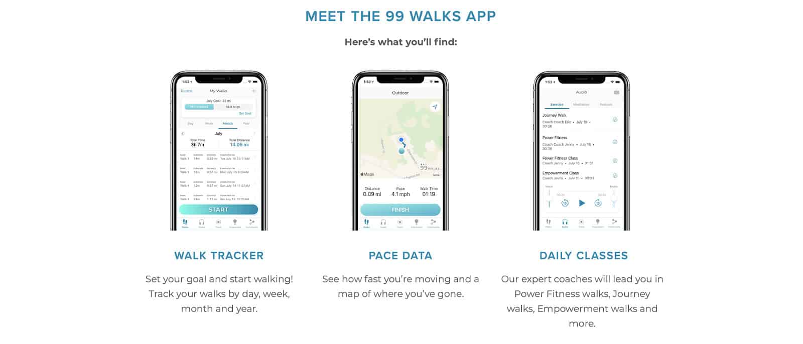
A long time partner with MindSea has been the team at 99 Walks. Their focus and dedication to client-centric approach translated from the very first steps of building the product.

Using participatory design in the construction of this mobile product was not strategic, but instinctual.
In having such a personal connection with each of their users, the survey approach to conducting research fit them and their audience the best. Users were willing and eager to help improve the product. Each survey helped to build a more detailed idea of who their users are and what they want from the app. This helped our team to improve their products and therefore their lives.
On a routine basis, the team with 99 Walks continues to conduct surveys to keep their product evergreen and competitive with the market.
Feedback Funnels
Feedback funnels are similar to surveys but require a little more initiative from the user themselves.
Instead of asking a direct question, users are simply prompted to leave feedback. What is nice about the funnel approach is that it leaves it open to the user, so any and all feedback is not only welcomed but encouraged.
Depending on the app owner’s preferences, you can divide feedback funnels into specific categories or “funnels” that better compartmentalizes comments. For instance, feedback can be separated into topics like features, bugs, and even one prompting users to share what they would like to see come to the app.
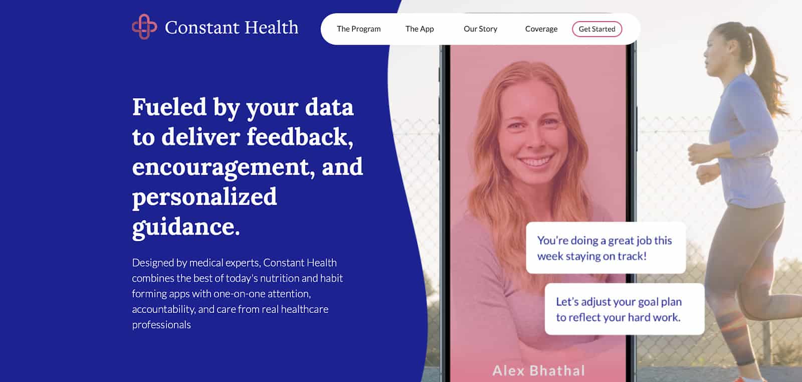
Constant Health is an mHealth product developed by our team in partnership with the Bariatric Medical Institute. This app helps users with weight loss, maintenance, and improving overall health. Going into this project, the team acknowledged the nature of weight control and identified how dynamic this part of our health is. Given that this is unique for everyone, the team wanted to include as many users as they could to ensure no subgroup was left behind.

Given that topics covered by this app may be sensitive to users, taking a more open approach allowed individuals to decide what they wanted to share and for what reasons. Users were not pressured to overshare or even participate at all. The prompt was simply an option for users to select a funnel and share recommendations, feedback, and potential concerns with the app owner. This concept is essentially a more direct version of a comment section on an app review page.
Earning a Glimpse into the Minds of Your Users
A more indirect approach is to take the data you have and extrapolate information from it. With humans being habitual creatures, you can collect a lot of information about how effective or ineffective a mobile product is by tracking a few key metrics. The metrics you track all depend on what information you are aiming to extract from it.
Analytics
Analytics are one of the most common tools used for measuring the success of various digital products and services.
Looking at analytics like installations and active users can give you a little more detail on the demographics of your audience. Whereas app retention and churn may be a little more specific and therefore more useful at pinpointing potential pitfalls or problems associated with the product.

We integrated this approach into our works with 99 Walks. While the survey results provided a glimpse into the minds of the users, diving into analytics provided insights that may not be conscious to users.
Data science has grown into its own established field to accomplish just this thing – taking a bunch of data and identifying habits that can communicate a user’s wants and needs without any added effort on the user’s end. By making this a typical practice in terms of app maintenance, we are able to provide users with updates they may not have known they wanted.
User Testing
While the act of recruiting users for user testing is direct, the process of observing and tracking the user’s actions is a little more discrete.
User testing is a standard part of the design process across the tech industry. The main goals of user testing are to uncover any usability issues with the navigation and core features of the app, and to test any assumptions we have about the product.
Our team is well versed in the realm of user testing. Our signature approach to app design and development continues to put users at the forefront, and one of our tried and true methods of upholding that is through user testing.

Often user testing is done in the early stage of developing a mobile product, however it is not limited to the beginning of the process. User testing can be used for betas, new launches, updates, redesigns, and more.
Our team decided to use this when making changes to our product with Constant Health. This allowed us to see what users wanted and listened to their comments to garner a better understanding about what they’re looking for in a mobile product.
Wrapping Up
Participatory design is not only a strategy, but a soon-to-be industry standard.
At the end of the day, your effort will be all for naught if no one is using your product. Furthermore, if users feel lost or ignored, they will start looking for something better.
Building with the user, rather than just for the user will help increase downloads, decrease uninstalls and avoid app churn.
Understanding participatory design is one thing, integrating it is crucial. Feel like you need a team to help with that? We have lots of experience and know-how to do it, so lets chat.


