Your new mobile app is pixel perfect. You’re in the middle of trying to raise money or develop a Minimum Viable Product (MVP). It’s going to be the coolest app on the market, but all you have in hand right now are visual designs.
How do you get early adopters (other than your friends and family), media contacts and investors lining up to be a part of your big app release?
A great mobile app landing page.
I’m going to share with you four steps to creating a great landing page for your mobile app. I’ll tell you about our workflow, tools of choice and show you real world examples to help you execute. Let’s get to it…
Step 1: Sketches
Your landing page should consist of the following four things:
- Your value proposition
- An image or demo video of your product.
- An explanation of your core features.
- A call-to-action (often referred to as a CTA) to get the user to sign up for release.
When you start to layout your page, be sure that you’ve expressed your value proposition, shown your product and included a CTA all before a user begins scrolling (this first part of the page is referred to as “above the fold”).
Mylo has done a great job of showing all the important facts above the fold.
Here is an example of an app landing page we recently designed:
You can see that we included the value proposition, a call to action, a hint of the product and the beginning of the features above the fold.
Structuring your page like this gives the viewer an opportunity to sign up immediately, or continue scrolling to learn more about your app’s features. No matter how long your page gets, you always want to be sure that there is a CTA nearby.
Get the Ultimate Guide to Digital Health App Design and Development
Unlock the best strategies, tips, and tricks we’ve discovered from 17+ years of digital product development.
Step 2: Craft Copy & Identify Content
You’ll need copy for your value proposition, call to action and feature list. When selecting your features to highlight, my advise is to choose three that directly relate to your value proposition and will convince the viewer that they need to sign up for your app.
For example:
Uber
1) Easiest way around
2) Anytime, anywhere
3) Low cost luxury
vEighteen
1) Experience more, own less
2) More hang time, less hassle
3) All the best sports brands, no hassle
Once you’ve determined what all your content needs to be, make sure it’s kick ass enough to connect with your product’s target audience. Once the copy is ready, it’s time to start designing.
Create mobile mockups of the app and other visuals that tell the story of your brand. This is a great place to get creative and have some fun. We often animate visuals to show off the important features we plan to build with tools like Principle, After Effects and Photoshop.
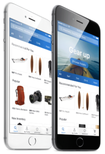
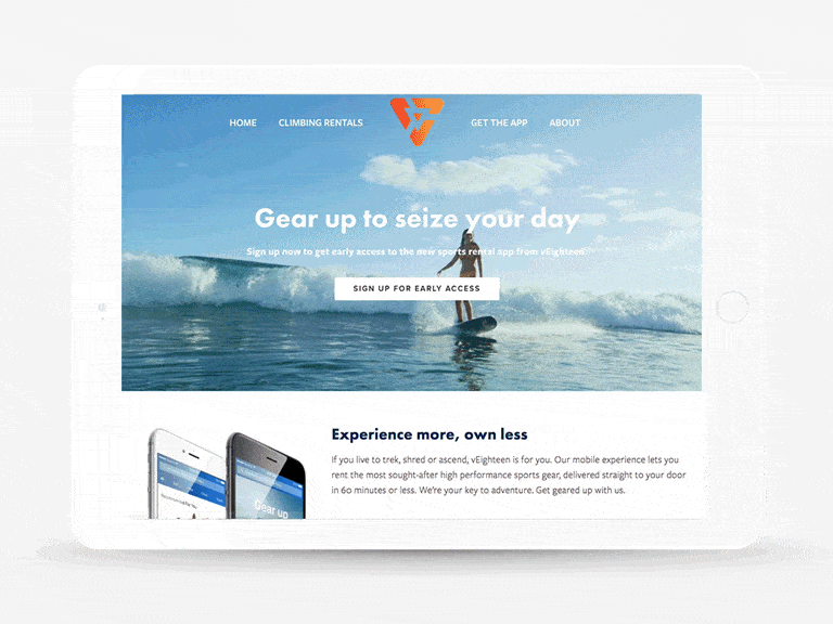
![]()
Here are some examples of imagery we created for the vEighteen landing page. We chose to focus on showing off the app and the end goal (having sporting gear delivered and users enjoying their sport).
Step 3: Build The Landing Page
There are a ton of amazing landing page builders and it can be overwhelming to pick one that works for you. In our experience, we’ve found many of the tools that market themselves to be landing page builders are buggy and their interfaces aren’t intuitive. If our client has an existing website that’s working well for them, we evaluate working with the platform they’re already using. If their platform is easy to use and allows us to create a great design, we’ll go with it. If our client doesn’t have a current site, or the platform isn’t catering to creating a killer landing page, we typically move to Squarespace.
Why Squarespace?
Squarespace is awesome for our designers and our clients. We get to provide eye catching designs and for clients who are more price sensitive, we can ensure that they don’t miss out on quality because of their budget. The design tools are flexible and we can access the code if we need to go further than the templates allow us. It’s extremely easy for the client to use in the case that they need to update copy in the future.
The imagery and content created can be worked into blocks on Squarespace. I won’t get into detail on how to use Squarespace but I can ensure you that it’s the least likely to cause grey hair out of your options.
Once the website is designed, it’s time to integrate services to make Squarespace even smarter.
What tools do we integrate with Squarespace?
Mailchimp
You need to track all signups and Mailchimp is the perfect tool as it allows us to create email campaigns announcing the launch and new features.
SumoMe & Google Analytics
SumoMe is a free, easy-to-use analytics tool that allows us to see Google Analytics right on the page, as well as heat maps and how much content is being read. All this data allows us to check in on how the page is performing and see if it needs any optimization.
Step 4: Launch & Promote The Landing Page
This is the final stretch. You’ve already done the planning and the building and now it’s time to push this landing page live. Go ahead and publish the landing page on your domain. Run a few tests to ensure that your landing page and mail chimp integrations are working. Once you’re confident that it’s good to go – it’s time to start promoting the app and driving people to the landing page.
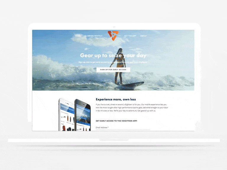
Here is an image of our final landing page design for v18.
You went from just having visual designs to having hype about your app flying around the internet. All your hard work has paid off and your user personas are now real people on your mailing list!
Looking for help with your app landing page? Contact us to collaborate.
Get the Ultimate Guide to Digital Health App Design and Development
Unlock the best strategies, tips, and tricks we’ve discovered from 17+ years of digital product development.