There’s something special about turning on the radio and hearing a classic hit from your teens. It’s a blast from the past that sends you into a moment of nostalgia and memories.
While old music conjures up good feelings, old design trends can quickly turn a mobile experience on its head. If you’re not up-to-date with the latest mobile design trends and best practices, you might be embracing old-school design practices that are no longer effective.
Massimo Vignelli was one of the world’s most influential designers. He put his stamp on everything from public signage and subway maps to housewares and furniture. Of design, he once said:
Styles come and go. Good design is a language, not a style.
In this blog post, we’ll look at a few “styles” that are no longer effective when it comes to mobile design. Avoiding these four bygone trends will ensure the design of your mobile app stays fresh and appealing to customers.
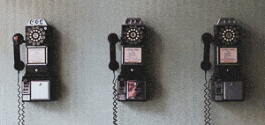
Folders For Navigation

There was a time when folder-style navigation was all the rage.
Thankfully, designers have recognized that having access to everything on the home screen isn’t exactly the best use of space OR what people want. When a user opens an app, they typically have a single goal they want to accomplish. The best designers understand that initial intent and create an experience focused around it.
That’s why Snapchat opens your camera as soon as you open the app. That’s why Facebook now takes you to your newsfeed immediately with the option to share.
To replace the folders at the top of a mobile app, designers have embraced a “less is more” approach by limiting the visible options to only the most important destinations and using flatter navigation hierarchies.
Strong Gradients

The design industry has a serious love-hate relationship with gradients.
You’ll find some brands who love gradients. You’ll find some brands who despise them. We’re of the belief that while gradients can be done well, sometimes a gradient doesn’t exactly serve the user in a way that makes their experience better.
Some gradients force people to take notice. Some gradients distract. Some gradients are subtle enough not to detract from the design. But the key to using a gradient effectively is understanding the gradient’s role and the way it impacts the overall experience. In many cases, designers use gradients simply because they want to and not because it’s better for the user. In that case, it’s best to go without.
Beveled & Embossed Buttons

Almost any designer who spent time making mobile products in the early 2010s can remember creating embossed and beveled buttons. At the time, they were all the rage, and tutorials for creating them were everywhere. From a usability standpoint, it made sense to use buttons with a deep bevel or emboss effect because they reminded users of tangible, real-world buttons and clearly indicated what was tappable on the screen.
And then came flat design, an aesthetic that would soon send all those bevel tutorials to the archives, never to be seen again. Designers realized that they didn’t have to hit users over the head with a visual hammer to show interactivity.
You could make the argument that flat design has been one of the swiftest and most pervasive shifts in mobile apps in recent years. It felt like less than a year or two that apps went from having beveled and embossed buttons to an entirely flat look. Today, it’s rare to come across an app with buttons that shine and glisten and much more common to find flat buttons, like these:
Tabular Bottom Navigation
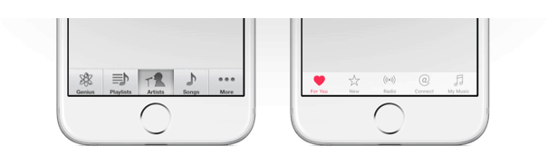
Just like folders across the top have all but disappeared, the navigation at the bottom of mobile apps has changed as well. Previously, when the bottom of an app included a navigation function, it was common practice to treat each item like a separate button that could be pushed independently, with lines in between to delineate the various options.
Rather than putting each icon in its own box, designers have started to realize that mobile users have been trained to know that one icon isn’t connected to the next and tabs across the bottom of the screen indicate distinct areas of an app. As a result, the cassette player approach to bottom buttons has disappeared and a more lightweight design style has come to prominence.
Wrapping Things Up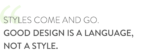
There will always be new trends on the rise and old trends on the decline. Our tastes change, and organizations like Apple and Google play a significant role in determining which design aesthetics are best practices and which go by the wayside. Sometimes design can be a matter of taste, but when it comes to user interfaces, design can greatly affect the usability of an app.
As a mobile app agency, it’s our job to stay on top of these trends and ensure that our clients are aware of what’s hot and what’s not as they create their apps. If you’ve built an app in the last few years that still embraces one or two of these old-school design practices, get in touch. We’d love to give you advice on redesigning your app to be more modern and user-friendly.