As we design interfaces we typically utilize and rely on design patterns to solve common problems.
As we design interfaces we typically utilize and rely on design patterns to solve common problems.
Design patterns are reusable solutions to common problems presented during the design process.
For example, iOS commonly uses the Tab Bar to solve the problem of navigating between views or modes in an app. Design patterns like these are great resources for solving a lot of the common problems designers face in app design, allowing us to focus on more mission critical problems like business goals, user needs, and the user’s expectations.
However, we need to be aware that while design patterns are great assets for quickly solving common problems, they are not ubiquitous between different platforms. Below we can see the app Instagram on iOS (left) and on Android (right).

Instagram was first built on iOS and its primary navigation is built upon a custom version of the iOS Tab Bar. We can see that when the Instagram team later built the Android version of the app, they made the decision to recreate the custom Tab Bar and have continually maintained it even though it is not a standard design pattern for Android devices.
Choosing design patterns that make sense for the context at hand — in this case the operating system of the device — can improve usability and the user experience for everyone. In this case where the iOS-style Tab Bar is non-standard for Android, using a different navigation pattern may help accustomed Android users more easily understand the navigation.
Choosing the right design patterns involves stepping back from patterns entirely and instead examine what goal they are supposed to achieve. Remember, the intended purpose of design patterns is to solve a problem.
Choosing the right design patterns involves stepping back from patterns themselves.
The process for doing this isn’t actually all that complicated. If you can identify the problem you’re trying to solve — or in other words the primary interaction you’re trying to design — you will find choosing the right patterns for the situation and platform is quick, easy, and simple.
We’ve outlined an easy to follow 4 step process below to help you do this, and provided an example for clarity:
1) Take Inventory
- In a few words identify the problem you’re trying to solve; in other words, the interaction you’re trying to design.
- Next, in plain english write down your information structure: all of the variables around the problem and the contexts you’re applying it to. (e.g., multi-device support, cross-platform, actions the user can take, etc.)
2) Map The Journey
- Write down the different paths the user can take to solve the problem.
- Next, rank each path in terms of priority to better understand which paths need to be addressed first in the solution.
3) Define Scope
- Define the scope of the problem by pairing the inventory you’ve defined and paths you’ve laid out. Focusing on figuring out the lowest impact solution that addresses the each inventory item in context to each path the user can take.
- Next, list the scope items in terms of scale from top to bottom. This provides context, showing the most impactful items to the least impactful.
4) Choose The Right Patterns
- At this point you should understand the context, priorities, and scope of the problem at hand. All of this will aid you in choosing a pattern that:
- Has the smallest footprint while solving the problem; remember the KISS Principle.
- Is common and/or comfortable in each given context, or solves the problem in a novel and functional way without feeling alien.
Now, let’s dive into an example to help illustrate the value of this quick exercise.
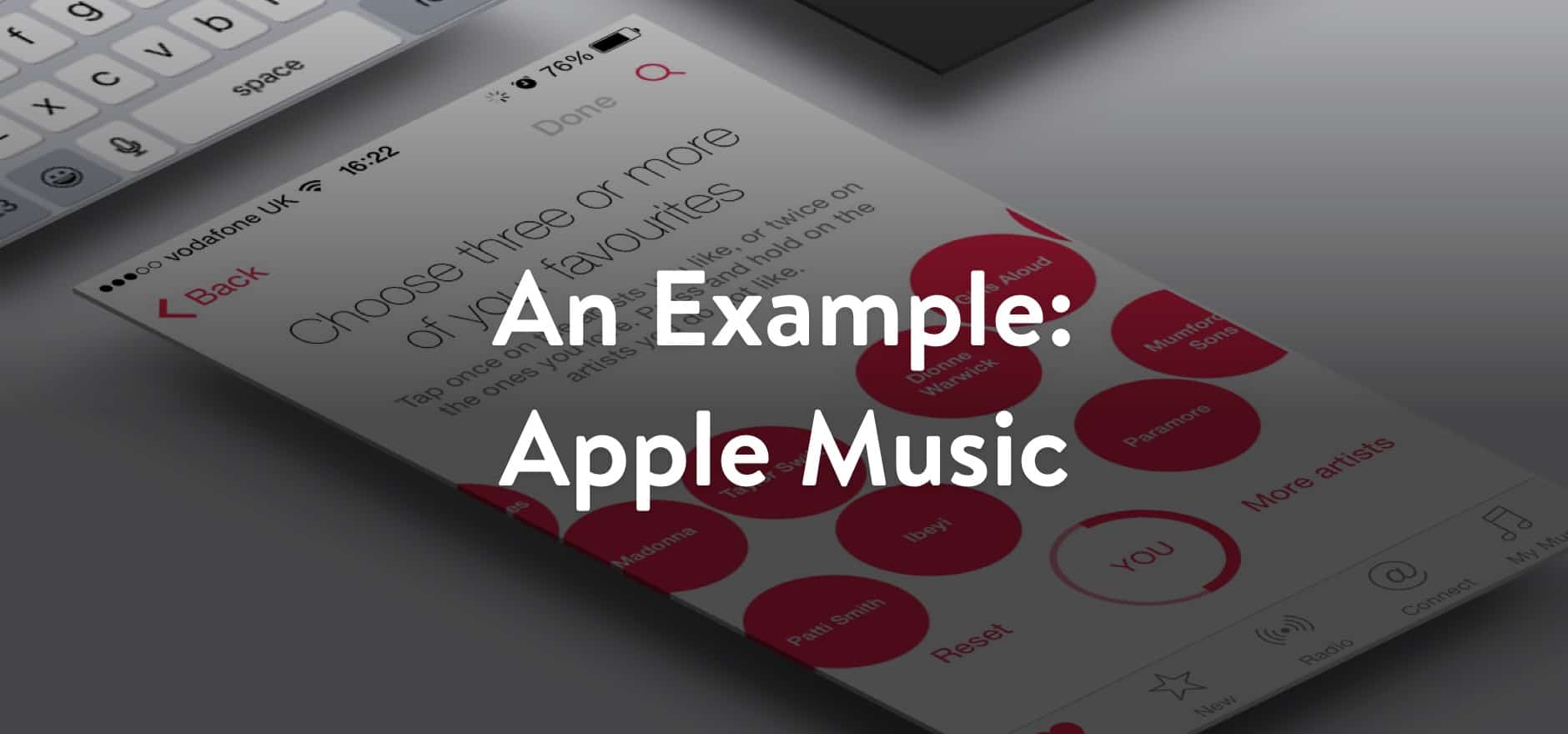
Unless your app only has one view or type of content, it will need some form of primary navigation. This can be a tricky problem as there are many different design patterns for navigation. Some of these navigation paradigms have a larger footprint on the experience or aren’t as instantly intuitive as others. Going back to the Instagram example, when moving from iOS to Android you have many things to consider when choosing your navigation pattern. Apple Music is a great example of this.
So, with that said let’s get started with the exercise:
Taking Inventory
- The problem that we’re trying to solve is that of primary navigation, which needs to be accessible from most pages.
- The app is going to be for phone only, but will be deployed to iOS and Android.
- The app has seven main flows: For You, New, Radio, Connect, My Music, Search, and Settings.
- The app has the following content: tracks, albums, artists, genres, and playlists.
Mapping The Journey
- The listener will choose a selection from the curated “For You” section and browse the selection to start listening.
- The listener will choose a selection from the “New” section and begin listening. This section will contain featured items, playlists, artists, and tracks.
- The listener will choose a radio station from the “Radio” section and begin listening.
- The listener will browse the “Connect” section, and potentially will dive into an artist page or begin listening to a track or album shared by the artist.
- The listener will enter a search query in order to find a track, album, artist, playlist, or genre.
- The listener will enter their settings to update their information and preferences.
Defining Scope
- The listener needs to have priority access to For You, New, Radio, Connect, and My Music. Settings and Search should be accessible from the main screens as well.
- Users are going to need to configure settings in regards to whether or not to use data and more; this is important to their experience.
- Search needs to be available from most pages, meaning it should be a constant part of the action toolbar or the navigation.
Choosing Design Patterns
Throughout this section we’ll be referencing different common design patterns between iOS and Android. At the end of this article are resources that you can reference for these.
Now we’re ready to choose patterns! We’ve established that our context is phones on iOS and Android so that’s where we will start.
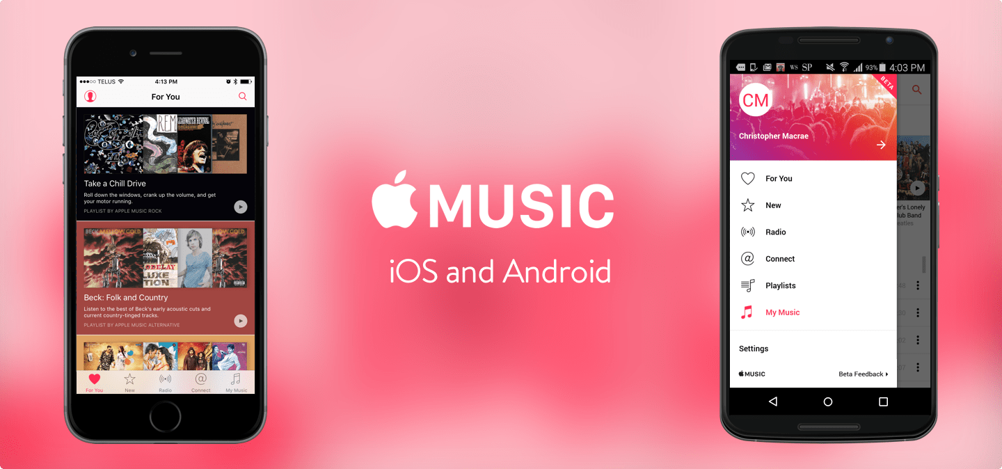
Given that we’re talking about an Apple product, we’ll start with iOS. On iOS the common navigation patterns are in-context navigation, a UI tab bar, a navigation drawer, or a combination of these. Apple chose to use the UI Tab Bar on iOS. Let’s examine some of the factors that may have impacted their decision.
Before you begin designing the navigation of an iOS app, it’s good to make sure you’ve got a good grasp of Apple’s navigation methodology. Following this makes a few things quickly apparent.
The first is that in a perfect world, a navigation drawer doesn’t make sense in a majority of iOS apps. Apple states that you should never put more than 5 items in a UI Tab Bar on phone resolutions, but the rule of thumb is to have a “more” button or to possibly rethink your navigation altogether.
Secondly, in-context navigation only makes sense when you have an extremely simple information structure that is only two levels deep, with the top level being a single view.
In the case of Apple music, we have a flat information structure. All of our primary flows are equal and interchangeable. Plus, our Settings and Profile flows can be accessed as actions in the navigation bar and be hidden when out of context, leaving us with 5 flows for the navigation pattern. That’s perfect for a UI Tab Bar!
Winner: UI Tab Bar
On Android things are little different. The common navigation patterns are in-context navigation, tabs, many different kinds of navigation drawers/sidebars, or a combination of these. Apple chose not to duplicate the UI Tab bar here. Let’s examine the factors on Android that may have lead them choose another design pattern.
On Android the UI tab bar is essentially replaced by material design tabs. These are buttons top-attached to the nav bar that function similarly to the UI tab bar on iOS with a few distinct differences.
The main difference is that these tabs usually come with the expected behaviour of horizontal swiping anywhere on the view to switch between the tabs. This means that nothing in view should compete with this, i.e, carousels, scrolling grids, etc. Since Apple Music has content like this tabs aren’t the best choice.
In-context navigation is also not a great choice for the same reasons as on iOS. So let’s take a look at the navigation drawer on the Android version of Apple Music. We see that the settings action on iOS now resides here, and that “Playlists” from “My Music” are now separated as two flows. This leaves us with 7 top-level navigation items, a perfect number for a navigation drawer.
On top of this, Android has a standard design pattern inside their navigation drawer for showing a visual header for accessing your personal information which Apple uses very well making the navigation drawer feel very comfortable to Android users.
Winner: Navigation Drawer
Conclusion
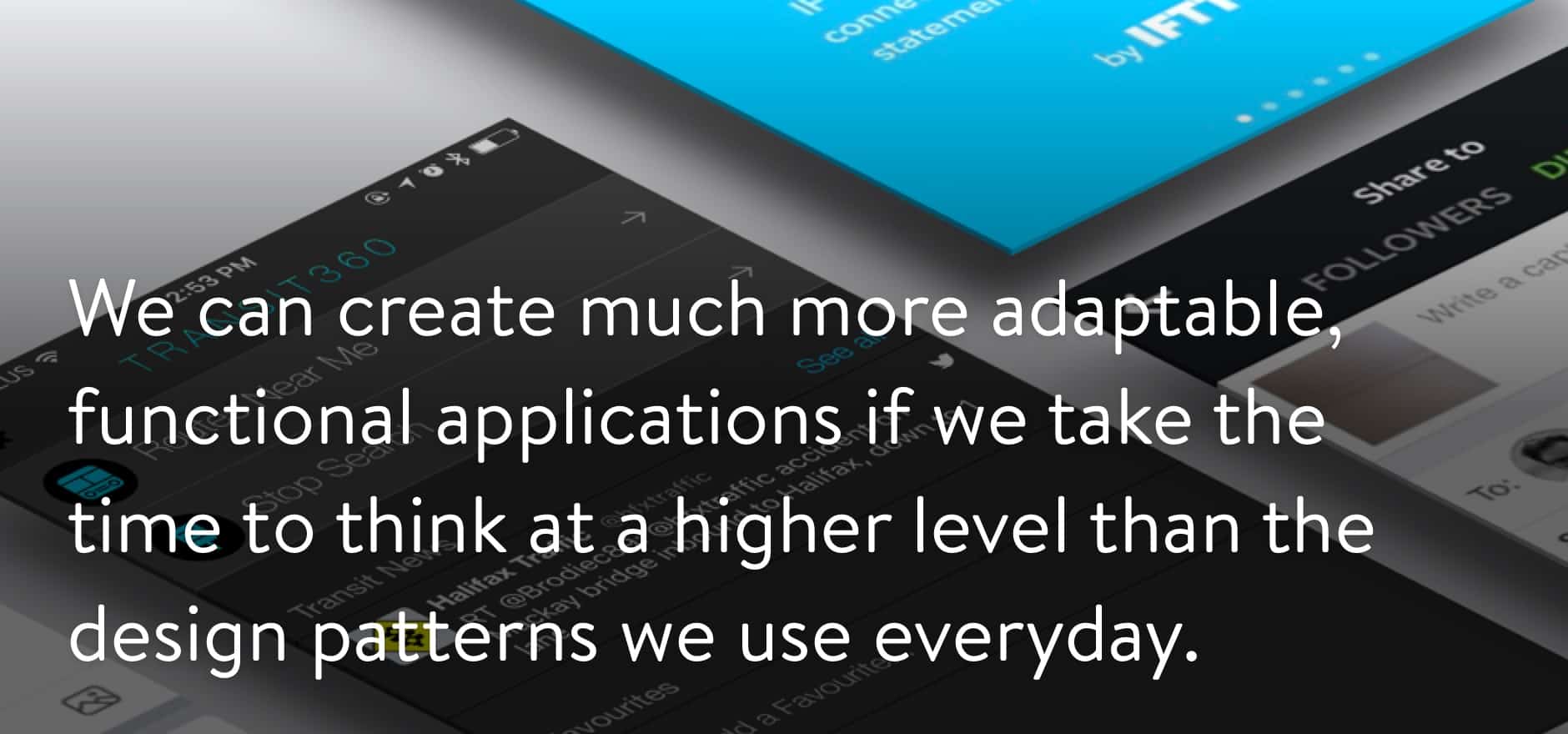
We can create much more adaptable, functional applications if we take the time to think at a higher level than the design patterns we use everyday.
Identifying the problem you’re trying to solve while choosing your desired patterns allows you to make informed decisions that serve the needs of your audience. Remember, not all patterns are alike and some patterns don’t belong on every platform or device. Choosing the right pattern for the job is about identifying all of the factors that impact the interaction and doing so not only ensures the patterns you choose fit their context but also ensures improved usability that feels natural to users.
Resources
To really understand design patterns and the core interactions that go into them, you should definitely become well-versed in the iOS, Android, and Windows UWP application design guidelines as well as the additional resources listed below:
Apple iOS Human Interface Guidelines