Case Study: CONSTANT HEALTH
Helping People To Become Better
Versions Of Themselves

The Project
Constant Health is on a mission to help you achieve your best weight and lead a better lifestyle overall. Your best weight is whatever weight you reach living the healthiest life you can honestly and realistically enjoy. This aligns well with our intent at MindSea to partner with innovative organizations that drive business value and improve lives.
Between fad diets, bad advice and poorly designed programs, people are set up for failure on their journey to a healthier, happier lifestyle before they even begin.
The truth is, there is no one-size-fits-all solution for weight loss, and that’s what the team at Constant Health aims to prove. Their evidence-based program focuses on long-term weight management, rather than just weight loss. It’s about finding your best weight—where you feel happiest and healthiest.
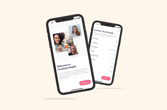
In partnership with BMI (Bariatric Medical Institute), MindSea’s team helped not just digitize, but improve the offline experience that patients have come to love. Working from our Blueprint, we built two web-based portals alongside the iOS app; this marked the true beginning of Constant Health. For the design, we took a partially developed UI and elevated it to meet modern consumers’ expectations.
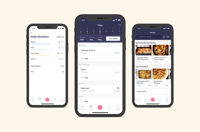
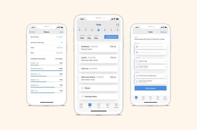
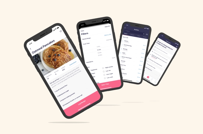
Using goal tracking, a nutrition database, and direct check-ins with a personal team of experts, patients in the 12-week Constant Health program remain motivated, accountable and on track to beat their hunger cravings and bad habits. And they enjoy doing it, thanks to the app’s simplicity, seamless navigation and advanced interactive capabilities.
Improve the Model
To understand Constant Health’s origins, it’s helpful to look at what BMI has been doing to date.
Currently BMI, alongside its 16 years of adult behavioural weight management program delivery, administers two Ministry of Health funded behaviour modification programs: One to parents of children with obesity, and another to patients undergoing bariatric surgery. For the second, BMI, in partnership with the Ottawa Hospital, provides the pre- and post-surgical care, education, and support for 20% of Ottawa’s bariatric surgical patients.
BMI is the only centre to provide ongoing behavioural programs to service both pediatric and adult populations, as well as care for those undergoing bariatric surgery. Between the company’s 3 programs, its experts have arguably the broadest base of patient care experience of any weight management centre in Canada.
Remote Healthcare For Increased Accountability
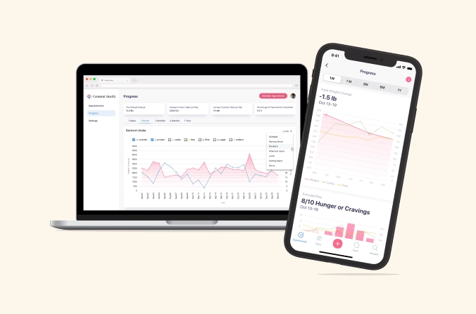
Despite BMI’s expertise in behavioral weight management, until now, its healthcare professionals had only been able to react to patients’ concerns and struggles after the fact, in their biweekly visits. What they wanted was a way to react proactively instead. Finally, technology has progressed to the point where behavioural intervention technology can meet that need.
But the team at BMI didn’t simply want a way to expand beyond its four walls, they wanted a way to improve the ability to serve their patients while doing so.
Designed with an equal focus on the behavioral and medical science required for long-term weight management, the team at BMI spent well over a year mapping out what its ideal solution would look like. They envisioned a tool that would be completely customizable to each client’s needs, medical comorbidities, and dietary preferences. This tool would allow health professionals to crucially monitor and respond to their patients’ successes and challenges in real-time, work with them to move toward goal completion, and create an almost effortless and familiar process for interactive appointments. This was the foundation of Constant Health.
A Support Team Designed To Help Patients Win
The build is made up of three components:
1. iOS App:
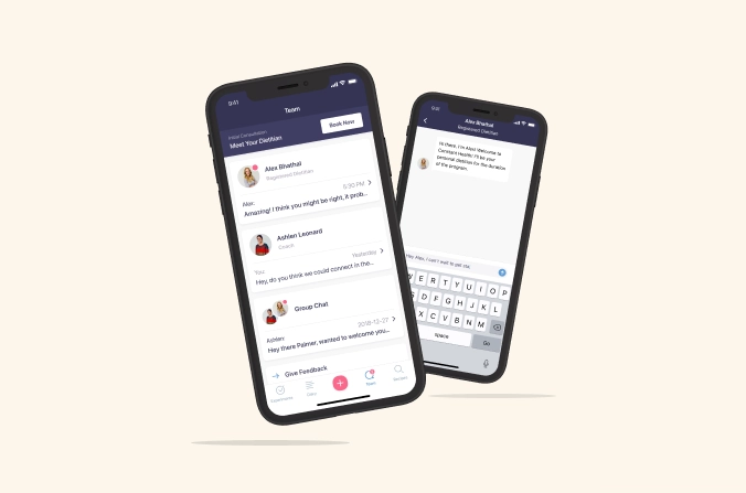
For patients to log food, track goals, have phone/video calls with clinician, search recipes.
2. Patient Portal:
Web based, leveraging React Material; for patients to sign up for the program, pay, schedule appointments
3. Clinician Portal:
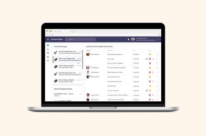
Web based, leveraging React Material; where the support team—coach and dietician—can log in to set goals and view progress, message and call the patients, view analytics.
The whole premise of the app is to walk with patients on their journey to a healthier lifestyle. Being able to connect with the experts they need most as they transition to better habits is an invaluable feature of this program.
For the entire 12 weeks, a certified wellness coach and a registered dietician work with each patient to develop daily goals. Patients get access to their team at the beginning of the program to establish what it is that’s driving them to reset their lifestyle and lose weight.
Partnership And Expertise
Partnership and expertise are essential to the way Constant Health operates, aligning well with our core values, and this guided the entire process of the app build. In their quest for a mobile app development team, Constant Health was looking for more than a vendor; they wanted a partner—someone they could trust and stand on equal footing with, and someone who could share unique ideas for bringing their vision to life. The founders of Constant Health know medicine, and they know their health solution better than anyone outside the organization ever will. As for us, we know mobile. We brought our expertise in native software development, design, user research and strategy to the table, and in the end, it was a match made in heaven.
Leading With A Clear Strategy
We begin every new build with our Mobile App Blueprint. It’s our unique process—our strategy that drives the rest of the project. The purpose of the Blueprint is to explore, in detail, all aspects of the client’s app idea, business objectives and audience, and to use these insights to develop a clear roadmap to launch. This is the only way to know not only what we’re building, but how to make it something the market will want. These were the particular goals for Constant Health’s Blueprint:
1. De-Risking Essential Features
We had to make sure that the app’s core features, such as the food database, live video chat and messaging, were fully realized in the first iteration. These features needed to make sense for the MVP, be tailored to the expectations and proficiencies of the target audience, and comply with PHIPA (Ontario’s legislation governing the collection, use and disclosure of personal health information by health information custodians, such as healthcare providers).
2. Ensuring Complete Compliance
Considering the nature of this app and its core functionality, data security was a major—and mandatory—consideration.
Complying with PHIPA meant ensuring data was stored on Canadian servers and that all other features of the app were completely secure.
3. Developing A Product Roadmap
Once we had a better understanding of what the project would entail, we could define our path to development.
It was essential to make sure the client and our internal development team were on board with the approach. By understanding each subsequent step—from design to user testing to launch to post-launch—we could execute against specific deadlines and budget constraints.
Designing With Our Persona In Mind
For the sake of the client’s patients, it was essential for the new Constant Health app to be native. Constant Health already had a partial design in place that they wanted to take up a few notches. That design had a hybrid UI with nonessential elements, cumbersome and misplaced features, and a less-than-intuitive UX overall.
Based on current BMI clients, we knew that our primary persona was likely a non-tech-savvy, middle-age woman with an iPhone. She’s looking for a simple, accessible design that is not overly clinical in look and feel, or technical in functionality.
The biggest improvements we made to simplify the UX involved navigation. We began by feeding the app through the Human Interface Guidelines (HIG)—Apple’s design guidelines for consumer products.
Based on our findings, we opted for a more streamlined layout and less customization. We also added a top navigation bar and completely changed the bottom tab bar.
MindSea lead the UI of this project; we developed the visual designs that lead to the development of new branding for Constant Health. We simplified the colours and made the entire app experience consistent with HIG criteria for interactive elements.
It’s Deeper Than Just An App
The main message Constant Health wanted to get across to its users: It’s not you!
Most patients believe that when they fail at something like a diet, it’s their fault—that their own lack of motivation and willpower is the reason they cannot commit. But too often, the program design has set them up for failure from the start.
A new diet does not mean you have to give up all your favourite foods or torture yourself in the gym. And what works for someone else will not necessarily work for you.
Constant Health’s goal is to change the mindset that success requires suffering. Their program is about achieving the best weight you can achieve while living the happiest life you can live.
Leading with positivity boosts a patient’s self-esteem, self-worth and belief in self-efficacy, which produces sustainable results.
At MindSea, we believe products like this do a lot of good in the world by impacting people for the better. We were happy to help!
“I believe in real partnership. Lots of people talk about partnership, but it’s not always achieved. MindSea came through on that end.”
–Lorne Segal, Co-Founder, Bariatric Medical Institute
Ready to build an app that improves lives?
Find out how MindSea can help you reach your goals.