App store optimization isn’t limited to keyword-stuffing your headline and hoping the app store ranks you above the competition. It’s much, much, much more than that.
App store optimization includes all the factors that increase the likelihood of your app being downloaded from the iOS App Store or the Google Play Store. Yes, you can use keywords to improve your ranking, but you also need to make sure people want to download your app once they discover it.
Mobile app developers may spend all their time and energy on the look and feel of their app and neglect the product shots in the app store—they simply take screenshots of the app and hope that people will figure out what they’re looking at.
That’s far from ideal!
Instead, you need to create visuals for your app store listing that will encourage people to download.
Unfortunately, we’ve seen far too many apps with bad app store images. To keep you from making the same mistake, we analyzed more than 50 app store product shots—the good, the bad and the ugly—and identified 13 clear examples to help you choose the right shots for your app.
If you want to create conversion-focused product shots, this blog post is one to bookmark.
And if you would prefer to have a PDF guide to share with your team, we’ve got you covered too—click here to download the 13 product shots (plus two extras). It’s completely free.
So let’s get to it! Here are 13 app store product shots to inspire you:
Showcase Priority Features
Example: Adam Helps
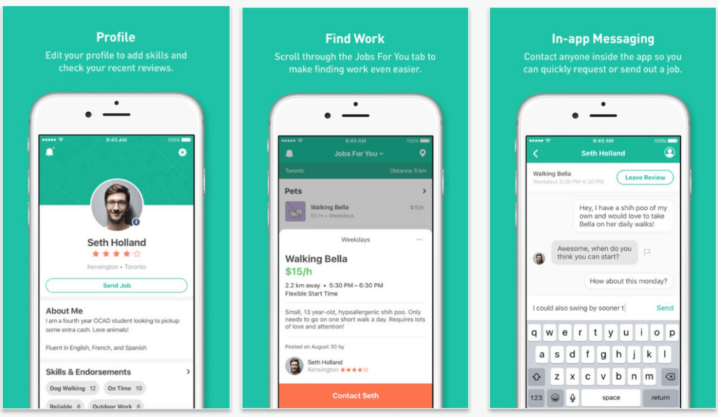
Whether your app is a household name or a brand-new offering, you need to make sure potential users can see exactly what your app does. The Adam Helps app store listing is a great example—the screenshots show the app in action and clearly communicate what users can do with the app. It shows people that within seconds they can post a job to the app or find a job listing and communicate directly with the person that hires them or they decide to hire.
Have Fun With Potential Users
Example: Bitmoji
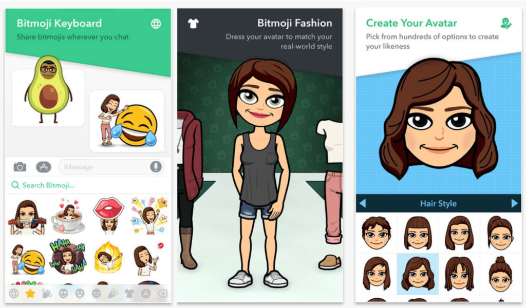
The team at Bitmoji knows that laughter is one of the most powerful human emotions. The visual of a person in an avocado suit and a crying laughing emoji on the very first screen makes an instant connection. Then the benefits and personalization features of the app are illustrated in the rest of the frames.
Show Real-Life Experiences
Example: Facebook
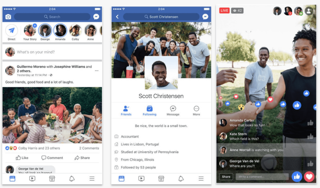
One of the benefits of being a well-known app is that you don’t really need to explain yourself. People know Facebook. Millions of people use Facebook every day. Rather than explaining its features in each shot, Facebook simply shows experiences taking place and being shared through their app. The focus on experiences and “Good friends, good food and a lot of laughs” is their way of demonstrating that Facebook breaks people closer together in the real world.
Know Your Target Audience
Example: Instagram
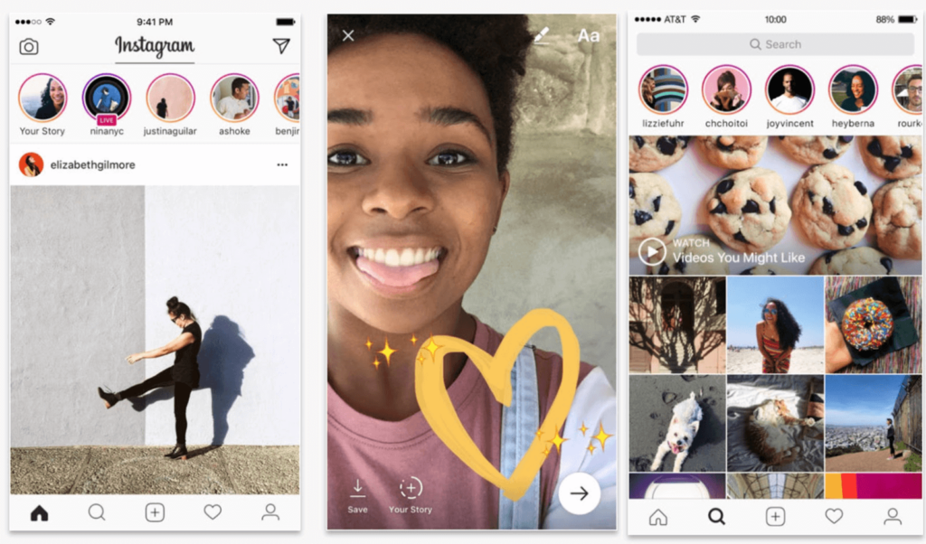
The most recent studies from comScore show that Instagram’s audience is nearly 60% female. So it only makes sense that in the first, second and third frames, you see females using the app. If you want your audience to download your app, it’s important for your visuals to resonate.
Don’t Water Down The Value Of Your Product
Example: Calm
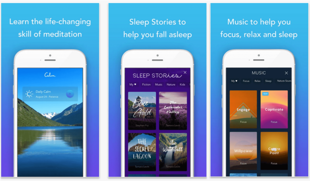
We’re huge fans of the Calm app. Not only do its product shots make you feel relaxed, they communicate the app’s value proposition. On the very first screen, you read that meditation can be “life-changing.” From there, Calm isn’t shy about touting key features like Sleep Stories followed by situations where meditation can improve your life.
Zoom In On Key Features
Examples: Flipp & Lyft
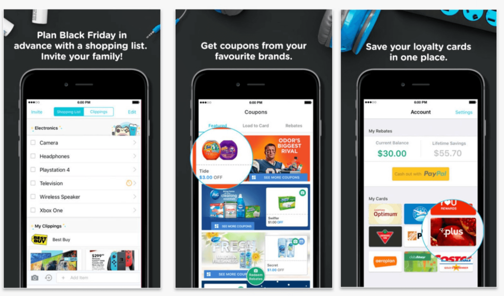
Some mobile app designers make the mistake of thinking their product shots HAVE to be straight screenshots of the product. In fact, you can have a bit of fun with your screenshots and showcase specific features, like the folks at Flipp did with these product shots. They’ve used a magnifying technique to highlight discounts and their loyalty program.
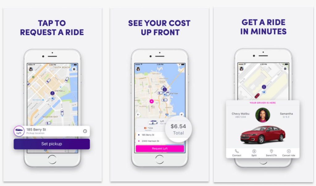
Lyft does something similar, zooming in on the three main steps of requesting a ride through Lyft. As a bonus, the magnified parts are big enough for people to see additional features of the app, beyond what’s described at the top of each image.
Help People Imagine What It’s Like To Use Your App
Example: FreshBooks
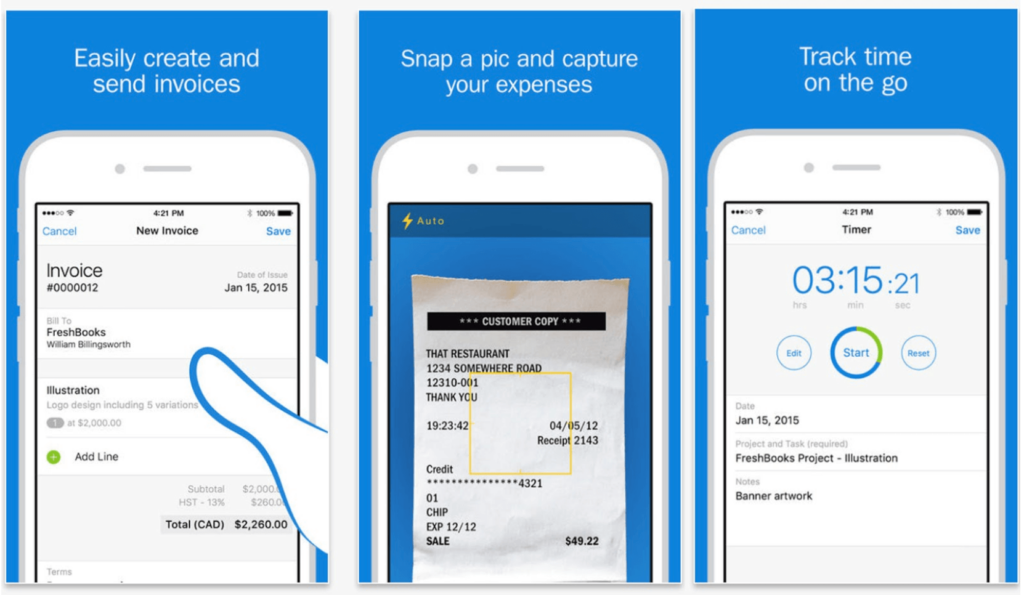
The folks at FreshBooks make it easy for users to get a feel for the app. First, the illustration of a hand using the app helps potential customers visualize the app in their own hands. Then the second image combines the real world with the digital world by showing the app scanning an actual receipt, making it easy to understand how the app functions.
Use Familiarity To Your Advantage
Example: Netflix
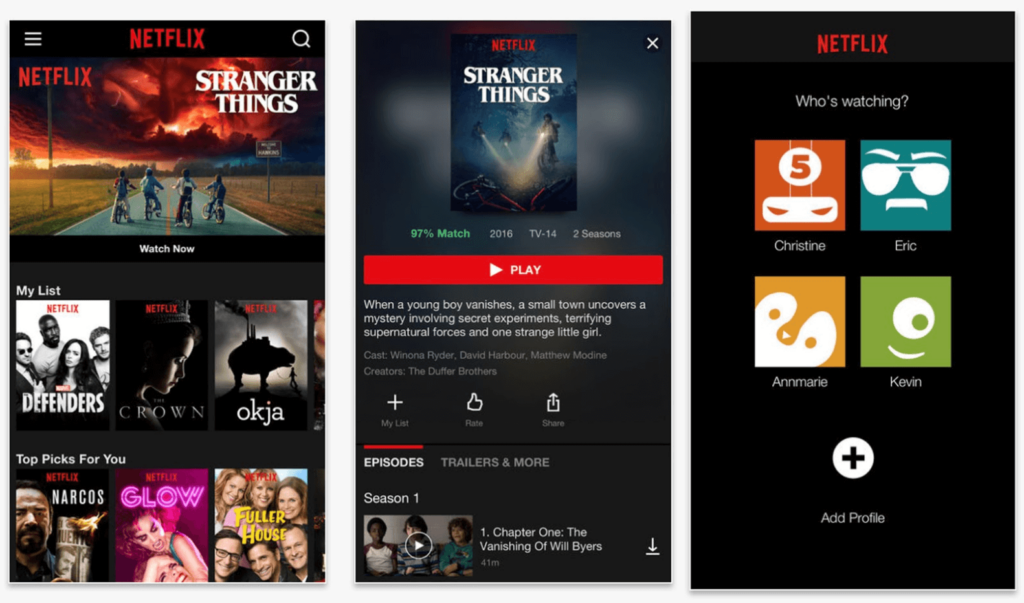
Stranger Things is one of the most popular shows on Netflix. It’s received tons of awards and has generated a HUGE following around the globe. If your brand is well-known for something, use it to your advantage. Put that familiar thing front and center to make a connection with potential customers and entice them to download.
Grab Attention With Faces
Example: Facebook Messenger
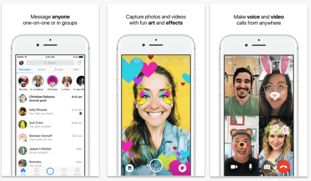
When you looked at the product shots above, what was the first thing you saw? If you’re like most people, your eyes immediately went either to the person in the middle or to the people in the screenshot on the right. People love people. We look for faces in clouds. We look for faces in bubbles. We look for faces in toast. If you’re selling an app that involves photos, videos or a chat feature, take inspiration from Facebook and use real faces to generate a positive response.
Bold Words That Matter
Example: Raccoon by Wattpad
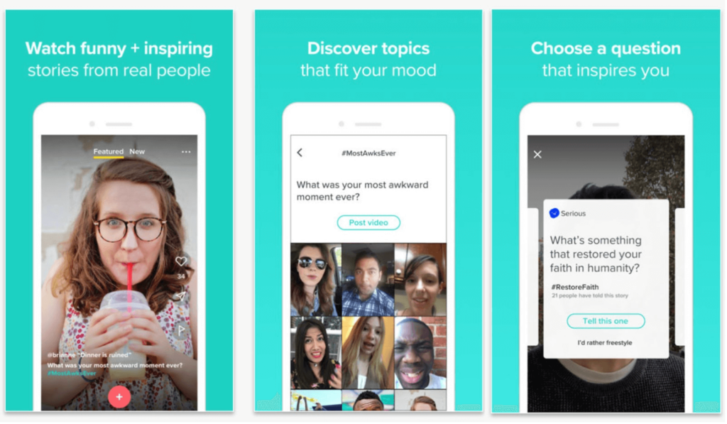
Like Facebook, Raccoon by Wattpad knows the value of faces. And like Facebook, they also recognize the value of emphasizing words that matter. The goal of this app is to create an inspiring and positive place to engage with other people, so “funny + inspiring” is bolded in the first frame. In the second and third frames, the bold text briefly communicates how you can use the app.
Don’t Feel Restricted To The App Store Frames
Example: Shazam
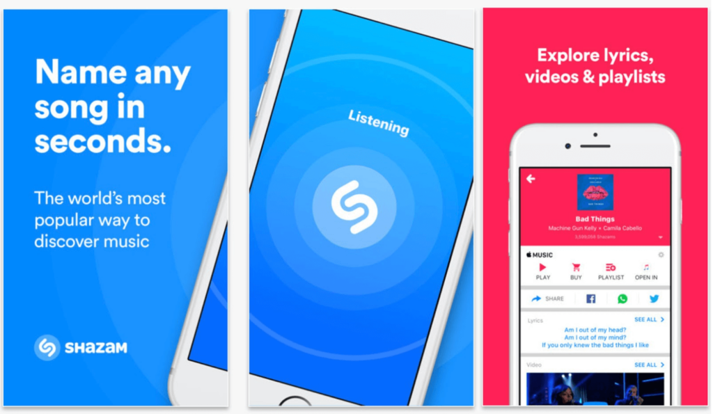
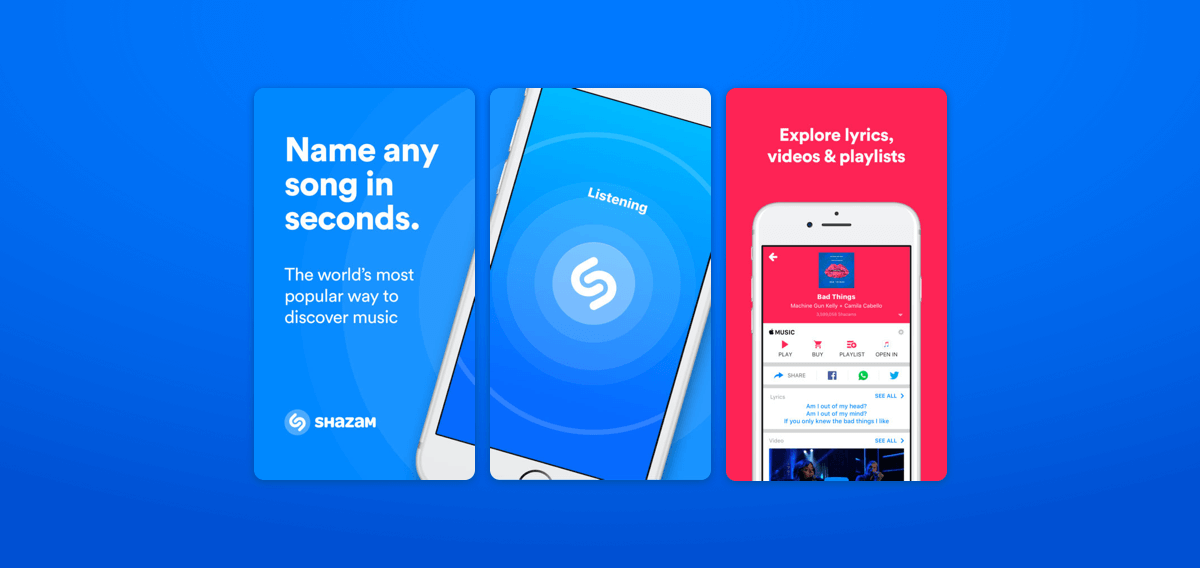
Rules are meant to be broken. Many app makers believe each frame available in the app store should be used for individual product screens. But some designers like the folks at Shazam (which was acquired by Apple for $400 million) and our team at MindSea don’t hold to that assumption. The results are especially eye-catching.
Use Psychology To Hook Potential Customers
Example: TBH
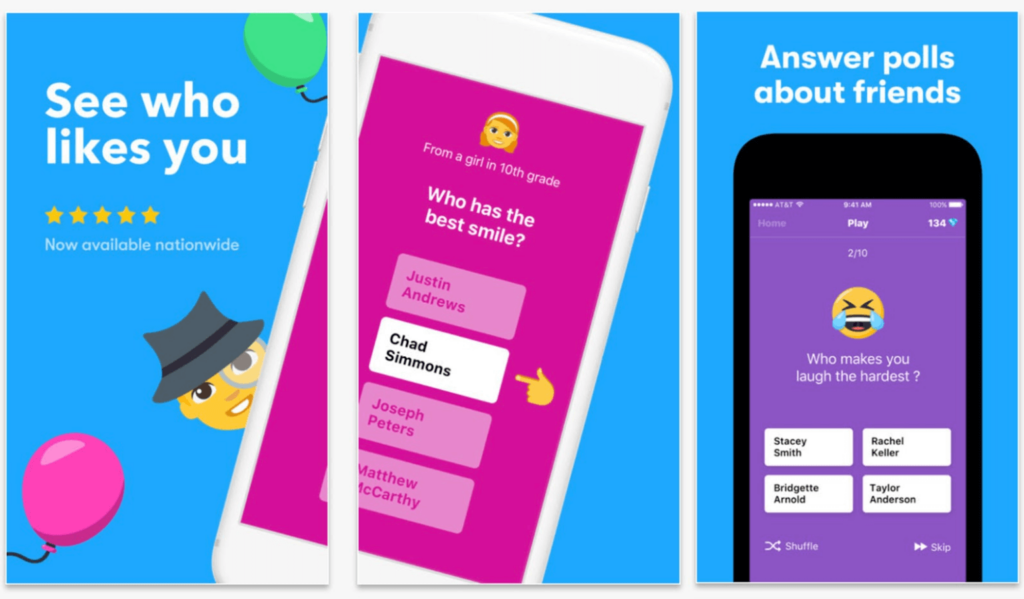
Using psychology to influence potential customers is definitely a touchy subject—but it works. In this example, you can see that TBH is clearly playing off people’s insecurities with the text “See who likes you.”
Wrapping Things Up
Whether you’re designing an iPhone app or designing an Android app, the product shots you use to promote your product are important. You know that first impressions matter when it comes to job interviews. Well, it works the same way for app downloads. The space on people’s phones is limited, so you need to show them exactly why your app is worth downloading.
If you’re looking for a few more tips for designing better app product images, download the full guide here.
