It’s one thing to create a successful web app; it’s another thing to create an accompanying mobile app that lives up to the expectations of your already happy customers. We’ve worked with brands who’ve taken on the challenge, so we know what it takes (and how good it feels) to launch a mobile app that customers are ecstatic about.
As we’ve discussed time and time again on this blog, mobile is redefining every industry. It’s no longer a question of whether you should invest in mobile, but when you’re going to make the commitment.
And if you’re in the SaaS business, your space is getting ever more mobile-friendly. So we interviewed some of the brightest minds in the industry to create a comprehensive guide that will help you make the move from web to mobile.
What Kinds Of Mobile Apps Can SaaS Brands Build?
When you’re thinking about a new mobile app, the first step is to analyze the role your app will play in the user experience. SaaS brands tend to create mobile apps that fall into one of three core categories:
- Complementary Apps: A complementary SaaS mobile app aligns well with the web app but has a few extra features that the web app does not. As an example, if your SaaS product is built for accounting across a company, the mobile app might only have the functionality to take photos of individual receipts, sync those receipts up with employee claims and then send data to the web app for your accounting team to review and approve.
- Stand-Alone Apps: A stand-alone app strives to accomplish everything that the web app does. The vast majority of the features that are available in the web app are also found in the mobile app. Trello is a great example—everything you can do on the web, you can also do directly from your mobile phone, from creating new Trello boards to uploading attachments.
- Feature-Restricted Apps: A feature-restricted app is a pared-down version of the web SaaS application. This kind of app is limited to only a few key features instead of the full functionality of the web app. For example, a feature-restricted CRM app might not allow you to send emails or set up automation sequences, but gives you the ability to view reports and data while on the go.
Whether you’re building an iPhone app or an Android app, the transition from web to mobile isn’t black and white. There are plenty of variables that go into the move, ranging from design to feature selection, usability and technical complexity. But that doesn’t mean it’s impossible.
Tons of companies have done it.
One of those companies is Salesforce, a legacy brand that revolutionized B2B SaaS and the cloud as a whole. Anwesha Samanta is a senior product designer at Salesforce and an expert at identifying the needs and wants of customers when it comes to mobile. He and the Salesforce Analytics UX team understand the value of chatting with users before building an app—in fact, that’s the first part of our app-building process here at MindSea too.
Why? Samanta calls empathy the “bedrock of good design.”
“The first step is understanding your end user,” he says. “One of the best ways to frame, structure, and align on information is to map the user’s path of inquiry, i.e., a structured outline of all the user’s needs to achieve their goal.”
According to Samanta, once you’ve taken the time to learn about your users and study their needs, the next two steps are to collaborate on ideas and then create a plan for the design and functionality of the app. The collaboration part of the process is built around sketches, and the plan involves wireframing and identifying direction.
But determining whether to create a complementary app, stand-alone app or feature-restricted app doesn’t happen during sketches or wireframes. It happens much earlier, based on your customer research—that stage Samanta described as the “bedrock of good design.” You see, it’s at this stage where you’ll talk to customers and learn what features they have on their wishlist and what problems they’d like to have solved through mobile. That will help you come to the conclusion about which approach is best for your SaaS app.
Additional Reading: How To Conduct User Research That Drives UX Success
Danielle Klein is a UX designer at FreshBooks. She writes, “There’s no one right way to approach a user interview. Even just 15 minutes with someone informally chatting about your product can elicit a lot of valuable data.”
Like Klein, we recognize that the first step in the process of creating a quality mobile app is talking to users and stepping into their shoes. We also recognize that the approach you take—from the room you meet in, to the tone of your questions—can influence their responses.
Klein says “striking the balance between making users comfortable and not biasing their behavior” is a key element of conducting effective user interviews. She takes it a step further by explaining an idea that’s foundational to our process at MindSea:
Try not to think of them as ‘users’—instead, they are your partners in creating a great product.
How often do you hear founders, designers or developers describe the people who have downloaded their product as users? The statistician and Yale computer science professor Edward Tufte once said it perfectly: “Only drug dealers and software companies call their customers users.” And yes, we’re well aware that we’re guilty of this too—even in this post there may be moments when we call the people who use apps, umm, users…but that’s beside the point! The point is about your mindset.
When you start thinking about your customers and clients as people instead of just app users, you’re on your way to reaching the level of empathy that is truly required to design a great product.
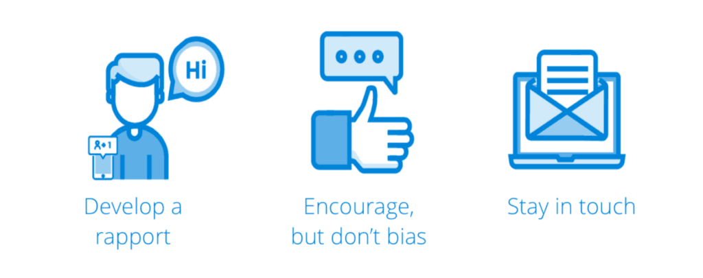
So how do you get valuable, unbiased insights from your interviewees? Klein breaks it down into three simple steps:

Develop a rapport: This idea goes hand-in-hand with the notion of viewing your users as partners. Klein says it starts with a warm introduction. “Get in touch with them individually on a personal level to introduce yourself. You don’t have to meet them in person—even an email will do the trick.”
Encourage, but don’t bias: The people you interview may answer your questions with more questions. It’s your job as the interviewer not to push answers onto them but instead to ask additional questions that can lead to insights about their needs and wants.
Stay in touch: Don’t make the mistake of thinking that once the app is shipped, you’re done with this test group. Turn these individuals into your advocates. “They’ll get invested in you—and you’ll get the insights you need to make them a great product,” Klein explains.
Once you’ve conducted user research, it’s important to understand what platform (or platforms) you’re building on. Is this app going to be built for iOS, Android or both? This question is important not only when you’re choosing a developer but also when you’re designing the user experience.
To get another expert take on UX design, we chatted with Thomas Michel, the lead designer at Mention. (If you’re not familiar with Mention, it’s a web-based tool that monitors your social media mentions. The company recently launched a stunning mobile app that plenty of people have pointed to as one of the best in SaaS.) The first thing Michel mentioned was platform constraints: “Users of different systems (be it iOS, Android or other operating systems) are accustomed to a specific experience, and getting too far away from each platform’s unique experience will make users uncomfortable.”
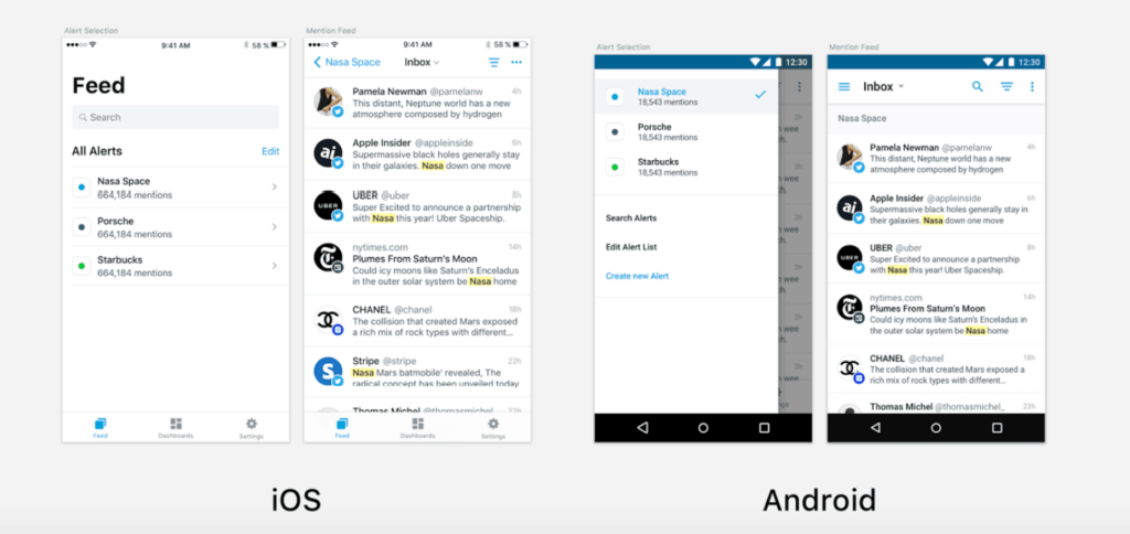
Here’s how Mention designed their iOS and Android apps based on each platform’s existing elements (e.g., burger menu on Android but not on iOS):

As you can see, the experience is dependent on the operating system. “If you want an intuitive and usable mobile product, you need to use existing elements from the platforms you’re working on,” Thomas says. As a result, both apps offer the same quality experience, but the way they look and feel is quite different.
Finding The Right Features For Your Mobile SaaS App
Once you’ve made the big-picture decisions about the type of app and the platform you’ll build it on, you can start breaking down the features your app will include. Michel says:
Try to stick as close as possible [to] the web product while bearing in mind mobile users’ needs. Just ask yourself, how will a user use your product at home, and how will he use it on the go? You’ll see that these two experiences are significantly different, and your design and development should reflect that.
Does everything from your web app go into your mobile app? How do you know what features to focus on? At MindSea, we bring it all back to these three key questions:
Who are we building for? Who from your existing user base is likely to embrace this mobile experience? Identify their role and understand their motivation for wanting a mobile experience.
When would your app be used? This is a question that far too many people overlook. When would it make sense for someone to leverage your mobile app? On their way to work? On the subway heading home? In the office giving a presentation? The use case can influence the app’s features significantly.
How does each feature add value? Create a list of all the priority features in the web app and ask yourself which ones would add value in a mobile version—and which would only add headaches. And I don’t mean headaches for the development or design team, but for someone using the app.
Once you’ve answered these questions, you should have a much clearer picture of what features to put in your mobile app and what can be excluded. It’s easy to fall into the trap of trying to squeeze everything into your app, but you have to ask yourself if each feature is necessary based on the purpose of the app, use case, user research and budget.
Michel says some features just don’t work on a mobile platform:
Some features work on the web app, but don’t make sense for mobile. For example, we let users create custom dashboards on the web app, but not on mobile, because it’ll be too tricky and time-consuming to do so on a small screen, at least for the moment.
The impact that screen size can have on design is not something to underestimate. A wider screen—like on a laptop or desktop—allows a wider range of functionality, while mobile is best for simple tasks and quick wins. Some apps, like Google Analytics, have a very streamlined experience with only basic functionality in comparison to their web counterparts. Yet other apps, like Buffer, offer close to 100% of their web functionality within the mobile experience.
At the end of the day, it really comes down to understanding your product and the people who will be using it. You need to understand what features and functionality would be valuable on the go, and what would add unnecessary complexity. Michel puts it this way: “By keeping the mobile user experience in mind, we avoid blindly transferring every single web feature to the mobile app and spending months developing it just to find that mobile users won’t benefit from it.”
But…What If Your Company Isn’t Ready To Build A SaaS App?
The fact that you’re reading this article indicates that, at the very least, you’re interested in the idea of turning a SaaS product into a mobile app, even if you’re not committed to it just yet. And that’s fine … In fact, that’s more than fine! Why?
Because far too many product managers make the mistake of creating a SaaS product and then sticking to their original roadmap, making mobile an afterthought. No customer feedback is taken, no user research is conducted and the product team and support team are not synced up so they can share feedback and product ideas in a formal or systematic way.
When we asked Michel about the role customers play in the creation and iteration of a mobile experience, he talked about the intentional effort that happens consistently at Mention. The product managers constantly collect feedback, before and after a feature launch.
If you’re not already collecting feedback from the people using your web app, you are potentially missing out on a gold mine. SaaS brands should continually be capturing data from the people using their products. This information can give you insights on the habits and preferences that will eventually shape your mobile experience.
Wrapping Things Up
We hope the process of building a mobile SaaS experience is a bit clearer for you now—that you understand exactly what’s required to learn about your customers and turn their feedback into a valuable product.
If you have any questions about our approach to Android or iOS app development, never hesitate to get in touch. We love talking about mobile apps, and we’re especially excited whenever we get the chance to chat with ambitious brands about their plans to integrate mobile into their product mix.


