We’ve used a number of mobile prototyping tools over the years to go from initial concept to interactive prototype.

We’ve used a number of mobile prototyping tools over the years to go from initial concept to interactive prototype. Most of them were decent enough, but they were all lacking in some way which kept us looking for better options. Many do not support scrolling, some have chunky screen transitions, and most have awkward UI that is frustrating to work with.
We eventually decided not to spend time learning tools that are limited to prototyping and instead to invest in becoming proficient at using Xcode, the de-facto tool for iOS development. Xcode prototypes are easy to get started on, are as simple or as complex as you need, and are a great stepping stone to building the final product.
And in this post, we’ll be walking through exactly how to use Xcode to prototype your app:
1. Don’t be Scared
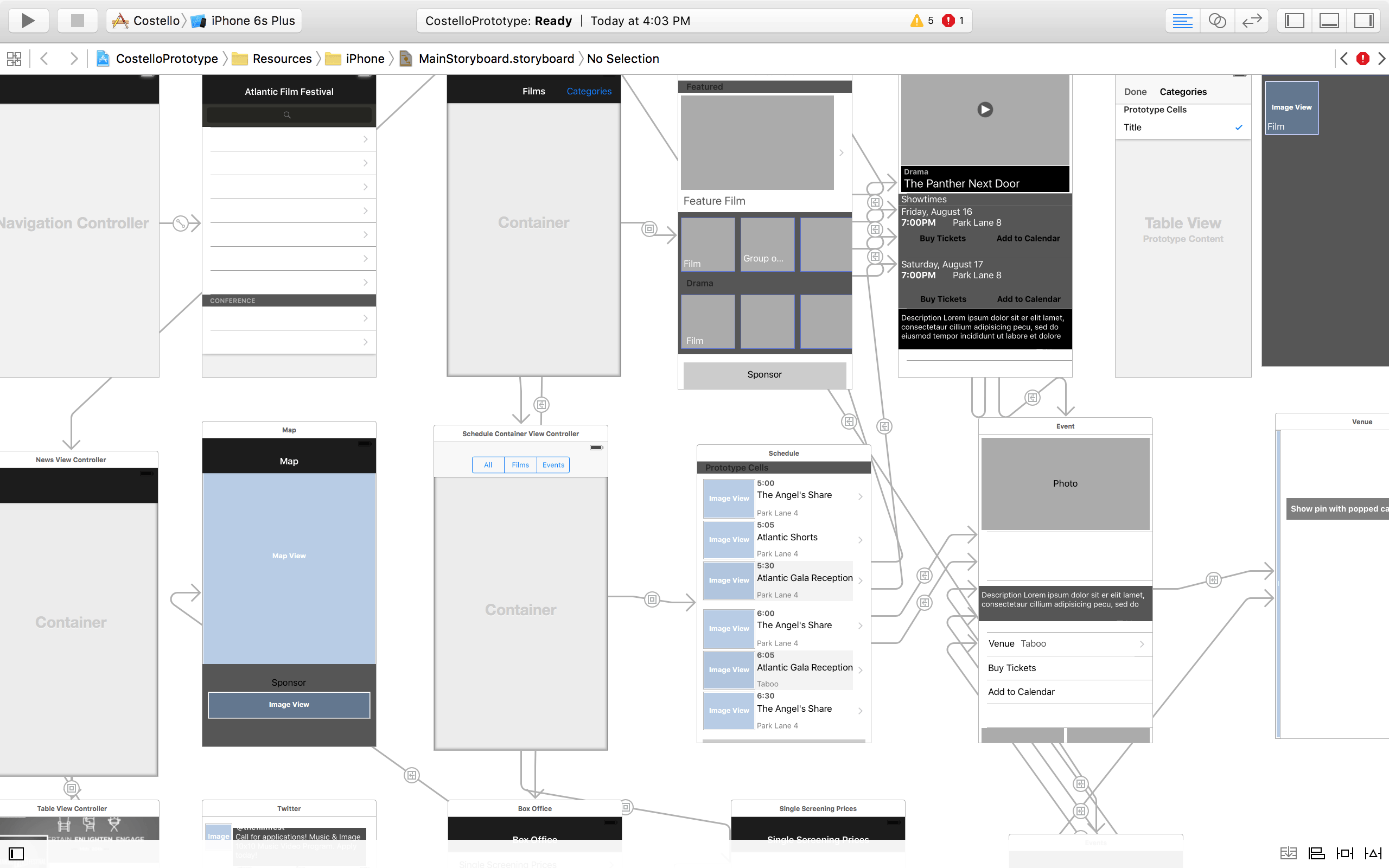
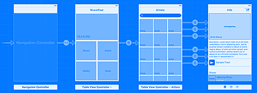
Xcode can be a bit intimidating at first because there is a lot going on in the multiple panes and tabs of the interface. Once it’s set-up though, and you get familiar with the structure, you can quickly start your mobile prototyping using Interface Builder and Storyboards. Screens are built by dragging and dropping view controllers and UI elements into the Storyboard.
Basic screen transitions like push, slide-up and flip are built into the segues that connect the views. There’s definitely a bit of a learning curve, but not much more than other prototyping tools. Xcode prototypes can be as simple as a couple of sketches hooked together with transparent buttons or they can use final artwork to simulate the finished product.
We prefer to build screens using gray boxes, placeholder text and stock UI.
It helps keep the process fast and fluid without getting caught up in the details.
Mobile prototyping with pixel-perfect visual design can look too much like the real thing which can cause confusion as to what is the prototype and what is the finished product.
If you want to achieve more complex interactions that are beyond what is available in Storyboards, you’ll probably need to enlist a developer to help out. Not every designer has this luxury, but if you’re not working with developers that can pull off the custom animation you dreamt up, then it’s probably not going to make it into the final product anyway.
2. Touch and Feel
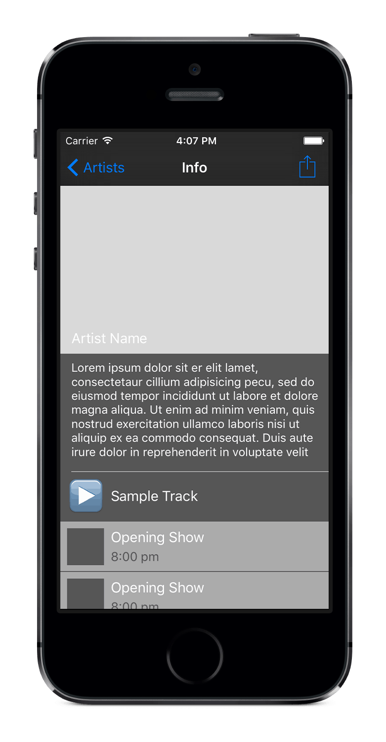
Previewing your prototype using Xcode is no problem because you can easily run your app on a device or in the simulator. You can quickly try out different flows and transitions and because you’re using native UI, you can get a real feel of what it would be like to use the app. The big win is that once you’ve shared your prototype around and everyone involved in the project buys in, it can be used as the blueprint for building the real thing.
Developers can get a better sense of the app and the intended UX. They can copy and paste rough layouts directly from a prototype into new Storyboards and start hooking up placeholder labels and image views to real data. There is no translation pain sifting through Photoshop files or static wireframes.
The final app will never end up exactly as it was envisioned in the prototype. Once real data and visual design are added to the equation, changes will inevitably need to be made. Through user testing and iteration, you’ll discover ways to improve upon the initial concepts that were impossible to predict at the beginning of the project.
Mobile prototyping with Xcode will help get you on the right path sooner and allow you to transition from prototype to final product more quickly. As a designer, learning how views are structured in Interface Builder will also give you a better sense of what image assets are needed to create your final artwork more efficiently.
It sounds like a great idea, but you’ll have to try it for yourself. The following tutorial will help get you started. Apple’s documentation and WWDC videos are great resources as well.
3. Storyboard Mobile Prototyping Tutorial
This tutorial will help you build a simple prototype with drill-down navigation based on categories. Like many apps where content is grouped into categories, a category contains a number of items and each item has some detailed information about it. In this case it’s a music festival app where the category is “Artists” and each artist has a photo, description, sample track and shows. This is a stripped down version of the prototype we created for the East Coast Music Association app.
Set Up
- Download Xcode.
- Install Xcode and select Create a new Xcode project from the Welcome to Xcode screen.
- Select iOS and Application in the left pane, then choose Single View Application and press Next.
- Enter a Product Name (e.g. MusicFest).
- From the Devices drop down select iPhone and press Next.
- Choose a location for your project folder (anywhere is fine) and press Create.
- Select MainStoryboard.storyboard from the Project Navigator (left panel).
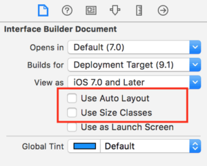 Select the first tab in the right panel and uncheck Use Auto Layout. This will remove constraints and simplify working in Interface Builder for beginners.
- When prompted to Disable Size Classes? ensure that Keep size class data for: iPhone is selected and press Disable Size Classes.
- We want to start fresh, so delete the View Controller Scene that is already in the Storyboard by clicking on it and pressing the delete key.
Home Screen
Our Home Screen will contain a large Feature view at the top and a grid of buttons for the other main content areas below.
- Show the Object Library by selecting the third tab on the bottom right panel. Find Navigation Controller and drag it onto the page. It will add both the Navigation Controller and a Table View Controller to your storyboard. Table View Controllers are an easy way to layout scrolling content.
 Select the Navigation Controller and then show the Attributes Inspector in the right panel (4th tab). Set the Top Bar to Translucent Black Navigation Bar. Also select Is Initial View Controller.
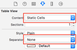 Select the Table View (inside the Table View Controller) and from the Attributes Inspector tab change Content to Static Cells and change Separator to None. With static cells we can set up our prototype table view exactly how we like it, with no coding necessary.
- Scroll further down in the Attributes Inspector and change the Background colour to Dark Gray. This gives you a nice, neutral backdrop to work on.
- From the document outline click Root View Controller to enter a title from the attributes panel.
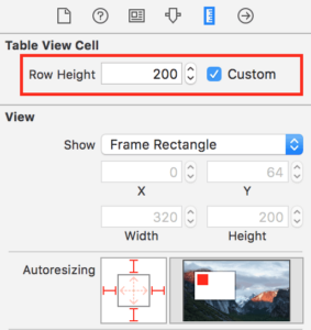 Select the first Table View Cell and increase its row height to 200. You can drag the handles to resize or you can enter exact dimensions in the Size Inspector (5th tab in right panel). Cells can be as high as you want and they’re a great way to create groups and hierarchy in your layout. They’re also really easy to reorder to try out different arrangements.
- From the Document Outline, expand the top Table View Cell and select the content view within it. Change the background colour to Light Gray. This creates the feature area which would have an image background in the actual app.
 Drag a Label into the Content View and type in “FEATURE”. You can change the font, size and colour of your text in the Attributes Inspector.
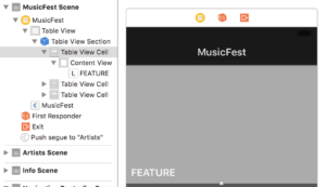 The first cell in your Table View should look something like this: (The document outline on the left shows the nesting of the different elements.)
- Change the height of the second Cell to 150.
 Drag a Button into the second cell and make it 150 w x 140 h so it fills half the width of the cell.
- Change the Button Type from System to Custom to remove the text. Type “Shows” in the Title input and change the button background to Light Gray. You can also change the position of the text within the button using the Inset values and Alignment.
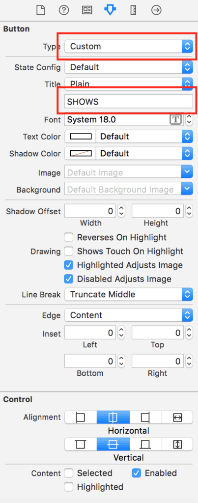
- Copy and paste the Button so you have two. Put them side by side to fill the cell. Tip: to quickly duplicate an item you can use the command-D keyboard shortcut.
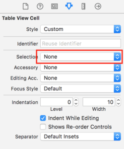 Select the Table View Cell and change Selection to None. The buttons are the interactive elements in this case so the Table Cell doesn’t need to be selectable.
- Copy and paste the Table View Cell to create a grid of four Buttons. Name them “Shows, Artists, Gallery and News.” Now you have the main entry points for your content. The home screen should now look something like this:
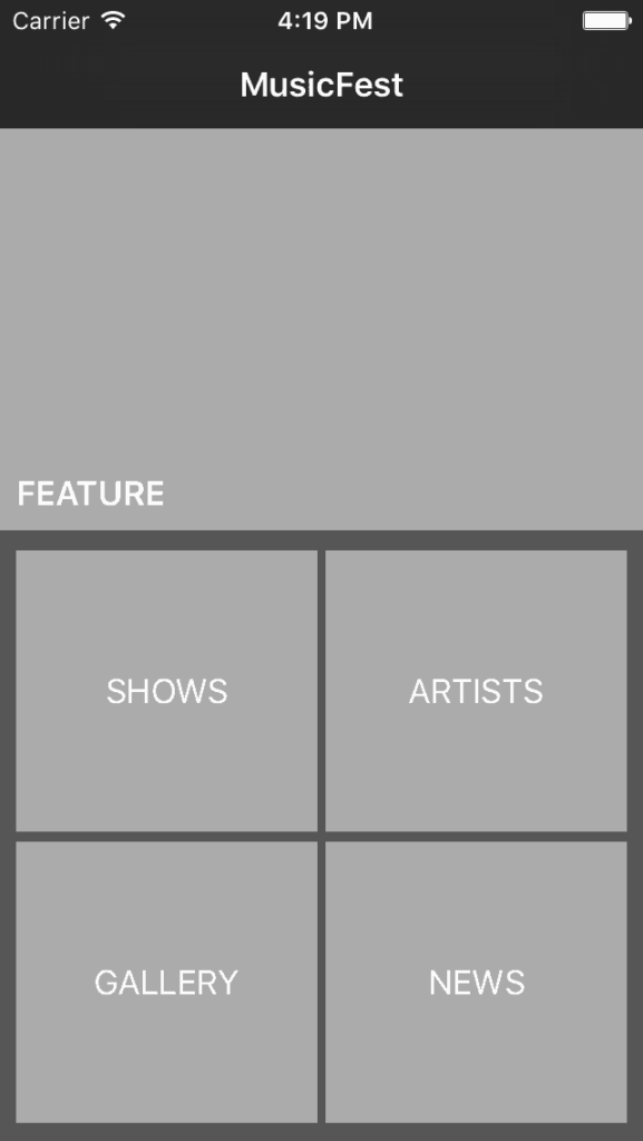
- Now is a good time to see this screen in action. Run the app on iPhone Simulator (iPhone 5s) (using the button at the top left of Xcode) to make sure everything is working. You should be able to scroll the view up and down and highlight the buttons. While mobile prototyping it’s good to get in the habit of running your prototype often to see how your changes take effect in the app.
Artists Screen
This screen contains a scrolling grid of artist photos with a search bar.
- Drag in a Table View Controller to the storyboard, to the right of our MusicFest table view controller.

- Connect the screens by holding down the control key and drag from the Artists Button on the home screen to the new Table View Controller. Select Push for the Action Segue transition.
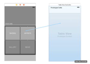
- Notice how the storyboard automatically shows you that the navigation bar will be on this new screen? Go ahead and name the new screen “Artists” the same way you named the other screen.
- Select the Artists Table View and from the Attributes Inspector tab change Content to Static Cells, change Separator to None and set the background to Dark Gray.
- Drag in a Search Bar and Search Display Controller in between the Navigation Bar and the Artists Table View. The search bar will automatically add itself to the right place. This will give you the default search bar behaviour and help your prototype feel more real.

- Change the height of the first Table Cell to 105.
- Drag a Button into the first Table Cell, change the size to 100 w x 100 h. Change the Button Type to Custom and set the background to Light Gray.
- Name the button “Artist” and position the text in the bottom left using Alignment and edge Insets. This gives you the basic building block for the grid.
- Copy and paste the Button and to make a row of three in the cell.
- Select the Table Cell and change Selection to None.
- Delete the two extra table cells from the table view.
- Select the Table View Section and increase the number of rows to 5. Xcode will automatically duplicate your first cell to fill out the table view.
- Your Storyboard should now look something like this:
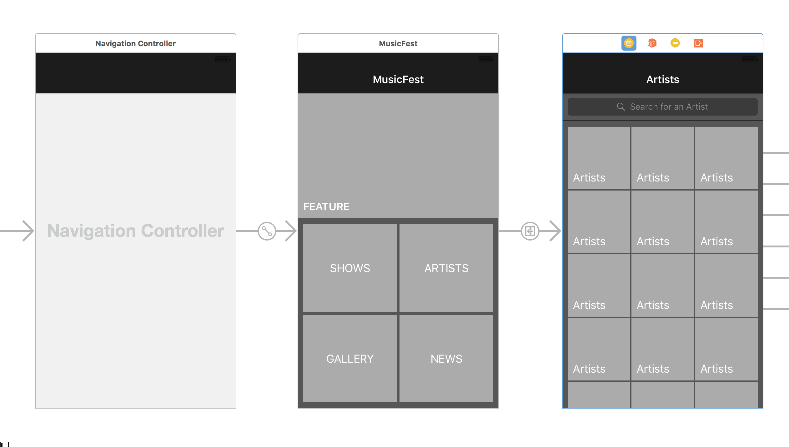
- Run your prototype and you should be able to navigate into the Artists screen and scroll it up and down.
Info Screen
This screen shows the details about each artist including their name, photo, bio, sample track and list shows.
- Drag in another Table View Controller to the right of the “Artists” screen.
- Hold down control and drag from each Button in the top two rows of the “Artists” screen to the new Table View Controller. Select Push for the Action Segue transition. You will end up with a Segue for each connection. You can hook up all of the buttons on the “Artists” screen but it will get a bit messy so we usually just hook up a few of the top ones so the functionality is there. We’re just mobile prototyping, remember!
- Give the new Table View Controller a name: “Info” seems appropriate.
 Drag a Bar Button Item into the top right of the Info screen’s Navigation Bar. In the Attributes Inspector tab change the System Item to Action. This is the standard Share Button style.
- Set the Table View content to Static Cells and change the separator and background colour as before.
- Change the height of the first Table Cell to 200.
- Drag in an Image View, change the size to 310 w x 195 h and set the background to Light Gray.
- Drag in a Label and position it above the Image View in the bottom left corner.
- Change the Label’s text to “Artist Name” and set the colour to White.
Description Text View
- Change the height of the second Table Cell to 140.
- Drag a Text View into the second cell. Change the size to fill the cell. Tip: use the Arrange drop down menu to quickly change the size to fill its container. This menu is also handy for centring views or aligning multiple views together.

- By default the Text View will be filled with placeholder text. You can delete some of it so the view doesn’t scroll, or uncheck Scrolling Enabled.
- In the Attributes Inspector of the Text View uncheck Editable so the text is read only.
- Change the background colour to Dark Gray and the text colour to White so it blends in nicely with the table background.
Sample Track Cell
- Select the third Table Cell and change the height to 60.
- Drag in an View, position it at the top of the cell, and set the size to 300 w x 1 h to create a horizontal rule. Tip: small views like this can be hard to select in the visual editor, but you can always select them using the outline display on the left side.
- Copy and paste the rule View and move the copy to the bottom of the cell.
- Drag a Button to the left side of the Table Cell and change it to 44 w x 44 h.
- Enter the Unicode character (BLACK RIGHT-POINTING POINTER, Unicode: U+25BA, UTF-8: E2 96 BA) into the Button Title. Start editing the button text, then open the Edit menu and select Emojis and Symbols. Find the character (you can search for the name) and double click (or drag and drop) to put it in the text. Using Unicode symbols for placeholder icons instead of images is a good time saver. You can even use Emoji!
- Add a Label to the Table Cell – “Sample Track.”
Shows List
- Drag in another Table View Cell to the Info Table View and add a Label “Shows.”

- Drag in another Table View Cell, change the height to 60 and drag a View inside it.
- Size the View to fill the width of the cell and be 59 h so there will be a gap at the bottom. Change the background to Light Gray.
- Drag in an Image View and two Labels to be the show’s photo, name and time.
- Duplicate the last Table Cell a few times (by copy and pasting or by increasing the section cell count) to fill out the screen.
Once there are more cells in a Table View than can be shown in that screen height, you have to select an item within the Table View and scroll down to see them.
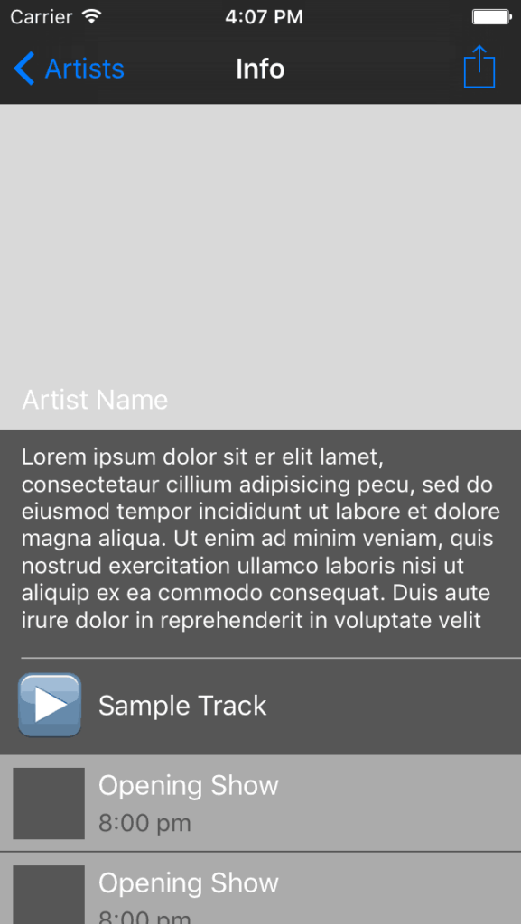
Your Info Screen should now look something like this:
…and your Storyboard should look something like this:
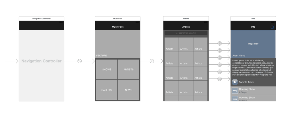
You now have a basic Xcode prototype built using native UI and without writing a single line of code. You can run your prototype on the iPhone Simulator as much as you like. To run it on a real iPhone or iPod touch, you need to enroll in the iOS Developer Program.
If you got stuck, or just want to skip ahead, you can download a copy of the Xcode project to play around with.
Make it Happen
Xcode is now our standard approach to mobile prototyping. It might not look pretty, but it’s a great way to get a feel for an app on device and try out ideas quickly.
With Xcode storyboards, designers can (and should) start mobile prototyping themselves rather than relying on developers to translate their static PSDs. And with a little bit of developer support, your prototypes can go to the next level and provide a great starting point for any project.
