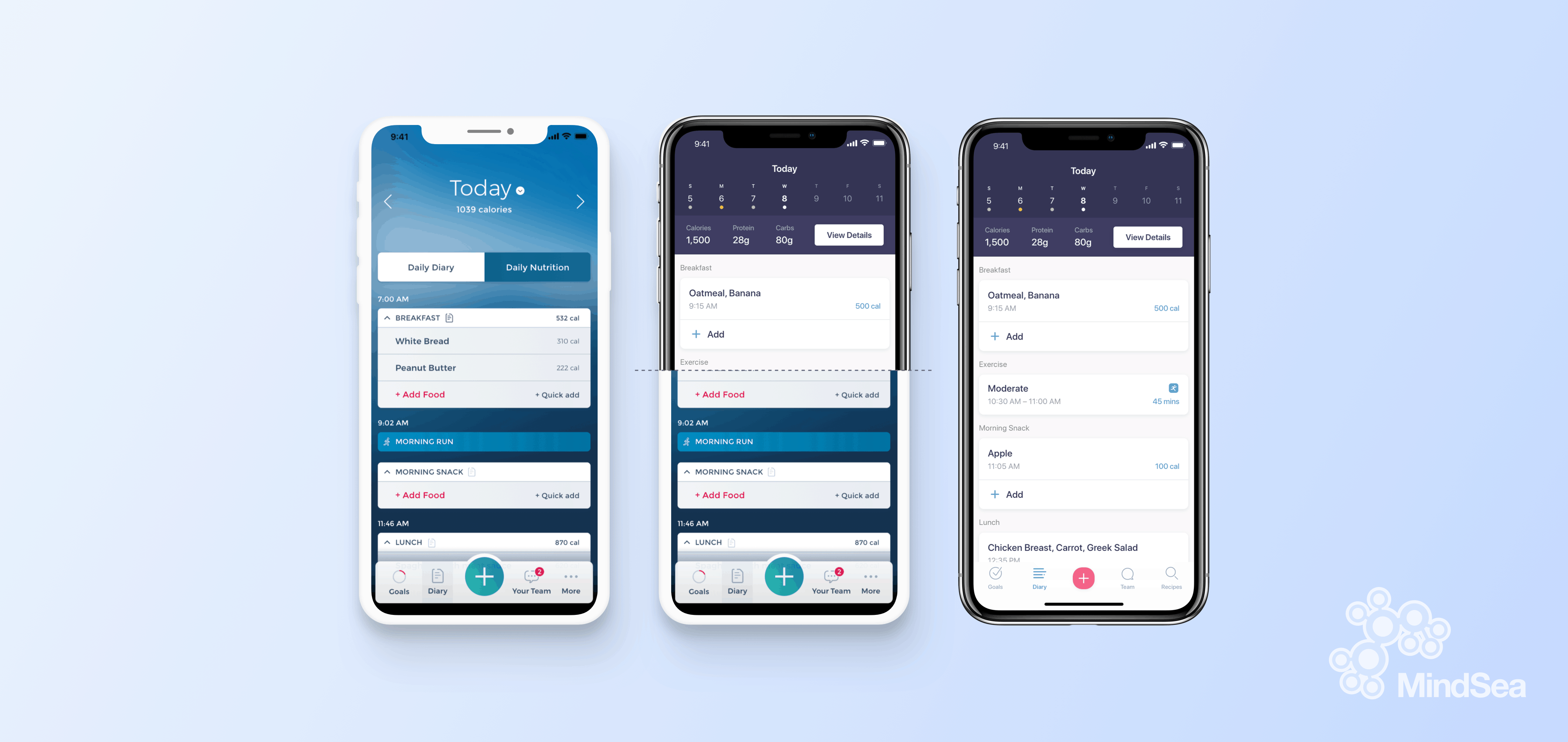
We probably don’t have to tell you that this year brought tremendous growth in remote working.
In light of the pandemic, 88% of office workers worked from home on a regular basis, according to the Work-from-Home Experience Survey. This is a massive increase from the year prior, when only 34% were working remotely.
Here’s the interesting part: This shift to remote work shows no signs of slowing down. According to the 2020 State of Remote Work survey, 98% of workers report wanting to work from home in some permanent capacity going forward. These stats not only communicate what’s happening right now but also serve as a window into future trends.
In the midst of this global shift—and other effects of the pandemic—companies in every industry have had to pivot to keep up. The challenge we’re all facing is not only adapting to these changes but capitalizing on them to propel our business forward. We’re facing a wave of app redesigns.
The business communications app Slack did just that when they released a total app redesign.
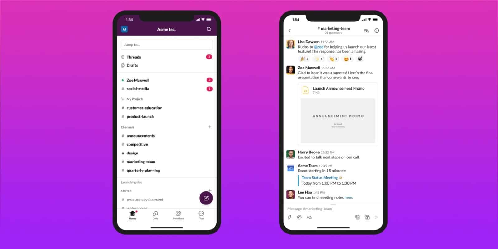
Slack’s redesign included a mixture of brand-new features and general maintenance in order to stay modern. The redesign also allowed the company to remain agile during the sudden spike in app usage, a trait that has helped them scale and accommodate their users.
Why Should You Conduct A Redesign?
Mobile app redesigns have the potential to take your product to new heights. But determining what changes will make your current product even greater requires some digging.
A common question that arises is this: Where do we gather the evidence and insights we need in order to launch a successful redesign?
This post outlines the three main areas to focus on when conducting preliminary research for app redesigns. This is the sort of approach that companies like Slack use to keep their audience engaged in their products.
1. Consumer Research
Who knows your audience better than your audience themselves?
No matter what your expectations are for your app, at the end of the day, what matters is whether people are using it. The best way to ensure this is to cater to your users. Here are a few tools to gauge your customers’ likes and dislikes when it comes to your app.
Direct contact
Providing a way for users to communicate with your company directly will serve you well when you embark on a redesign. One of the primary and most effective platforms for two-way communication with your users is social media. Through your social channels, you can keep your audience informed while collecting valuable feedback on your product.
Ratings
Another way to gain user feedback is through app reviews in the Apple App Store and the Google Play Store. The star rating and—even better—the comments can say a lot about your app.
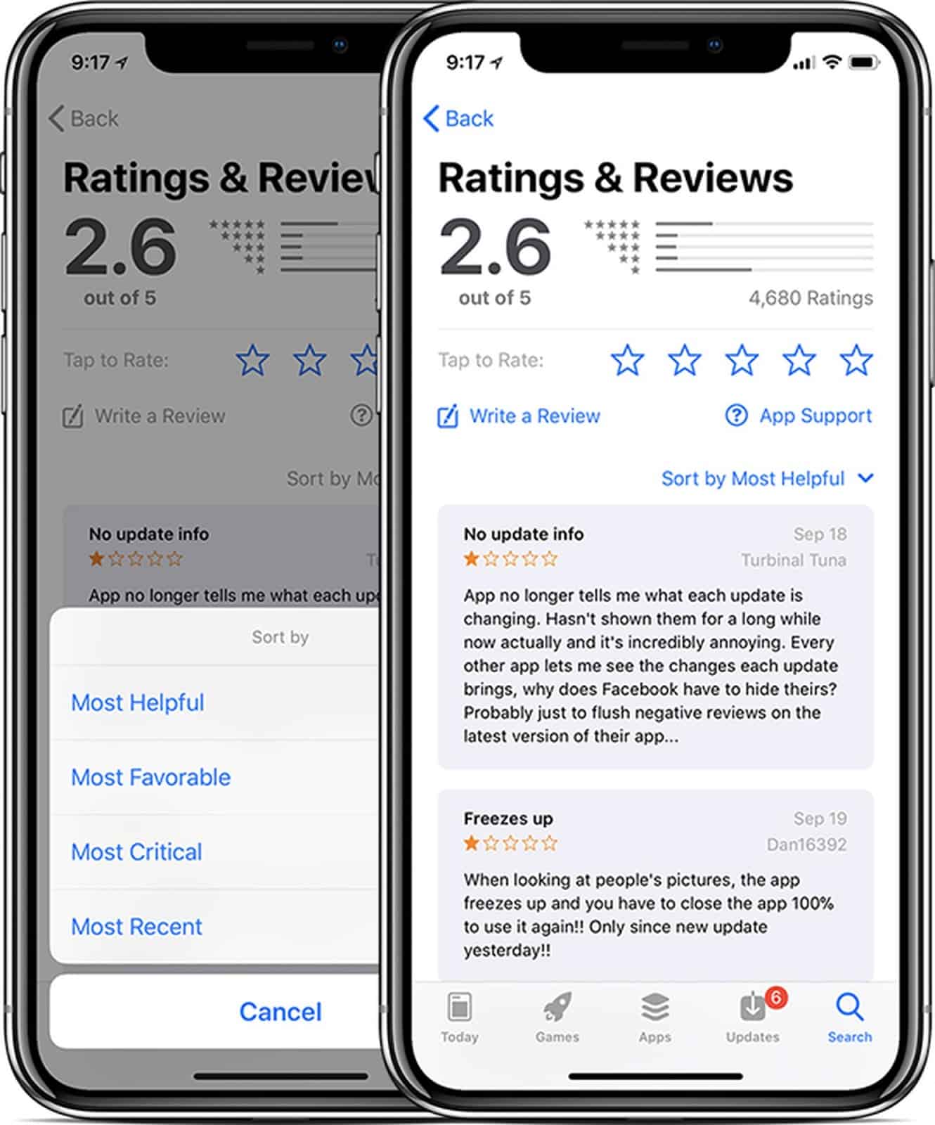
It’s always nice when people acknowledge the app’s strengths, but when you’re looking for potential improvements, you especially want to recognize any pain points mentioned by your users.
Online Audit
To tap into indirect user feedback, perform an online audit to see where and when your company and/or app name has been mentioned. You can do this via Google Analytics, you can search the name on various platforms, or you can set up Google Alerts to inform you when the name is mentioned somewhere online. This is just an extra means of seeing what’s being said, where and by whom.
User Testing
A final and common method for getting real-time user feedback is through user testing. As you observe how users interact with and navigate your app, you can better understand how to improve your product to fit their wants and needs.
Seeing the app in action and hearing the customer narrate their thought process allows you to pick up on their major pain points.

Real-time user testing also reveals smaller issues within the app that might otherwise be easily overlooked. These small but crucial instances of friction can make a difference when it comes to user retention.
Slack’s redesign relied heavily on the involvement of users, so much so that they termed their strategy as a “co-design” approach. They stripped down their app and rebuilt it from the foundation up based on their audience’s needs. Changes were not only informed by users, but inspired by them as well. The new app is cleaner and more adaptive and features a sleek UI designed for beginners to navigate. This redesign exemplifies the benefits of listening to your audience.
2. Industry Research
It’s hard to be an industry leader without staying up to date on what’s happening in your industry and in the world of mobile.
The mobile industry is evolving by the minute. What you may think is “brand-new” could be outdated by next quarter. Staying up to date on the platforms you’ve released your app on is paramount in ongoing app maintenance.
The App Industry
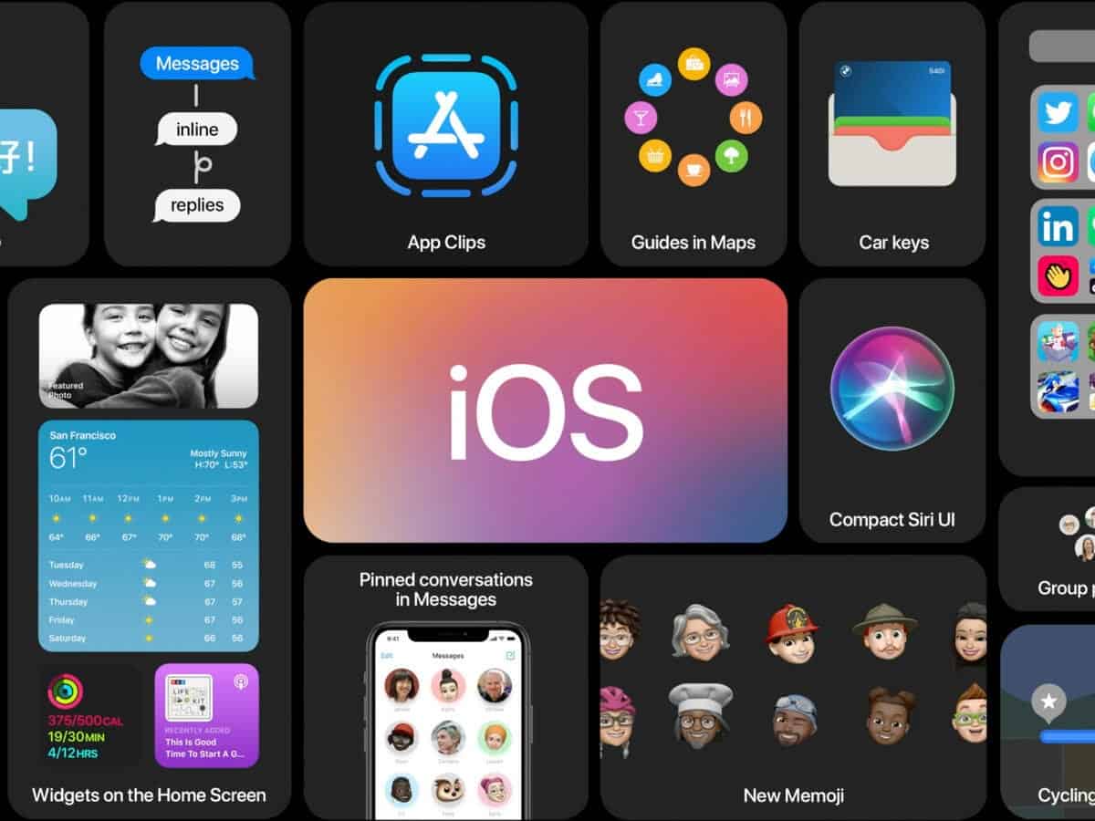
One way to stay updated is by being aware of big announcements and events held by companies like Apple and Google. Most recently, Apple held the 2020 Worldwide Developers Conference at which the company announced lots of big things, including iOS 14. It is important to ensure your app is still compatible with the latest OS updates; otherwise, your app will quickly become useless.
Your Industry
Understanding your own industry is just as important. A modern app with all the latest features is great, but if your content is behind it can be just as detrimental as out-of-date technology.
Staying current on innovations within your field allows you to see opportunities for your app and business to grow.
For example, internal communication platforms have long garnered complaints about being convoluted. This has inspired many such companies to simplify their tasks for a smoother user adoption, and Slack did so in their redesign by adding shortcuts. Slack also added the ability to rearrange channels in a personalized order. This “click and drag” method of customizing is nothing new; we’re all used to doing that to reorganize our desktops and home screens. Sometimes simplicity and familiarity are more important than innovation when improving a product.
Analytics
Analytics are invaluable in establishing where your app stands when it comes to industry standards. There are a variety of metrics to look at, including:
- App downloads
- Active users
- Average time and screen views per visit
- App retention
- App churn (users lost)
- App rating
In addition to these high-level stats, you should investigate which features are being used the most and least, where users drop off or exit the app most often, and how often people use the app (daily, weekly, monthly, etc). Details like these can reveal areas where the user becomes uninterested and highlight features that aren’t being used.
3. Competitive Research
If you’ve noticed downloads and engagement rates dropping, is it possible that people are getting their needs met elsewhere? A competitor analysis has two key pillars: who your competition is, and what they bring to the industry.
Who is your competition?
A useful practice is to step back and put yourself in the shoes of your target audience. Do the typical market research that someone in your target demographic would perform, such as looking at reviews, visiting company websites and comparing what various apps offer.
You need to be aware of the existing solutions and thought leaders in your industry. A competitor analysis will highlight who you should be watching out for, as well as expose opportunities that your competitors have overlooked.
What sets you apart?
What is it about your app that differentiates you from your competitors? Are they doing something you aren’t? Are they doing something you do, but doing it better?
These are all questions that a prospective user will likely ask before committing to download your app.
Establishing where you stand amongst your competitors in terms of functionality, ease of use and UX/UI design may tell you why users are (or aren’t) using your app.
Staying Competitive
Slack’s app created a ripple effect of app redesigns, like Gmail’s. We can imagine that Google, conducting their own competitor research, took notice of Slack’s new and improved product and decided to incorporate some similar functionality in their own update.
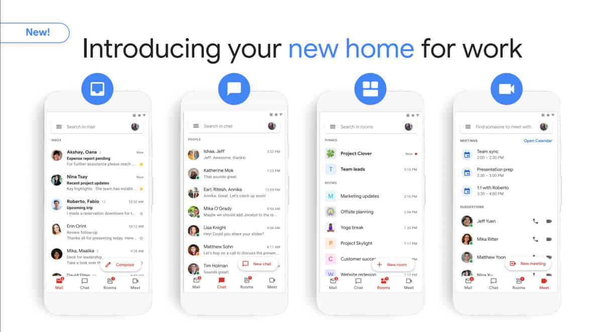
An app redesign is an opportunity to look at any shortcomings in your app and not only match but surpass competitors. It serves as a challenge: How can you shorten the number of steps it takes to perform tasks in order to create the best user experience on the market? This stage of research can inspire the biggest innovations and most creative solutions for your redesign.
Wrapping Up
As Steve Jobs once said, “People don’t know what they want until you show it to them.” This is why it takes a mixture of industry, user and competitor research to figure out what the market is looking for.
The Slack app redesign did exactly what a redesign is supposed to do: Not only did it provide a better user experience but it sparked a wave of app redesigns amongst its competitors—which means Slack must have done something right!
Their “co-design” approach is similar to ours—we integrate user feedback with supporting analytics and evidence to produce an app that’s built to perform.
Ready to join the wave of app redesigns? Let us know, and see how we can make your mobile solution stand out amid the clutter.
