App redesigns have received a bad rap over the last few years.
As mobile app creators, we’re always watching to see how the user bases of the most popular apps respond to a redesign. We watch not only how these companies conduct themselves during the rollout but also how they conduct initial user research for the app.
We’ve all seen the criticism and uproar that spreads across the web like wildfire whenever a major app makes a change. That’s why it so important to recognize that during a redesign, you’re not going to make everyone happy.
It doesn’t matter if you’re Airbnb…

…or Uber…

…you’re always going to risk making some users unhappy.
Over the last few years, we’ve been part of major redesigns for many of our clients. We’ve found our Mobile Blueprint process to be one of the best ways to get started on the right foot. But aside from that, we’ve identified a series of steps that can make the redesign experience less painful and more likely to result in a positive outcome for both the user and the business.
Here is a step-by-step process that will help you win with your app redesign:
Step 1: Understand Your Initial Goals
As Simon Sinek stated in his famous TED Talk: Start with why.
Start by asking why you’re redesigning your app. Is it time to redesign because user experience trends have changed? Is it time to redesign because you launched a new feature? Is it time to redesign because the competition is providing a better app experience?
This is where you need to start. Once you have identified the rationale behind the change, it’s important that you keep coming back to this reason throughout the redesign experience. Your entire design team should understand the why and be committed to achieving this overarching goal.
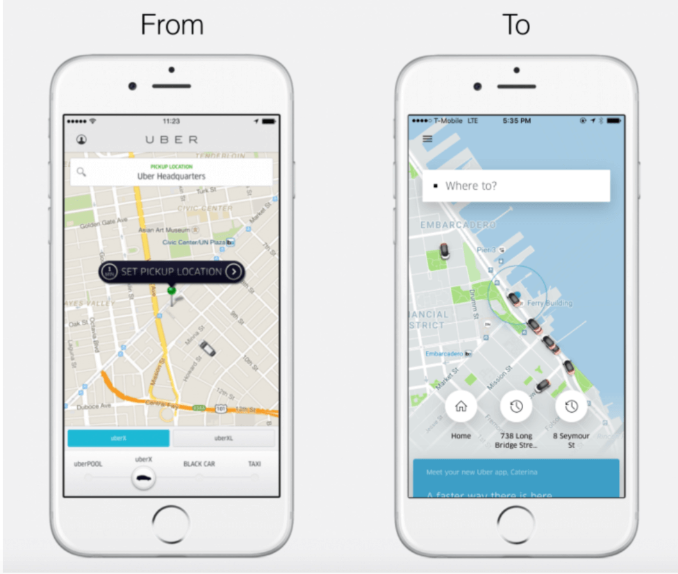
When Uber underwent their most recent redesign, they started with their why. The app had previously added a variety of new features, which was causing confusion and creating a subpar experience for users. As the head of design wrote in Uber’s announcement about the redesign:
As we added more features and our products became more complex…People were selecting the wrong product when they had to catch a movie.
By starting here, Uber was able to create a mobile experience that puts users’ priorities front and center. Understanding the why allowed the company to create a more intuitive and user-friendly app. Here’s a before-and-after look at their primary screen:

Step 2: Communicate With Users To Gain Insight
One of the most underestimated steps in the redesign process is communication. At this stage, you already know exactly what you want to accomplish with your app redesign. Now you have to communicate the impending change to people who love and frequently use your app. Once you’ve communicated this, you can meaningfully engage your users and learn what they do and don’t like about the current mobile experience or what they’d like to see changed.
Embracing an open line of communication with your users is so important. It can truly be a competitive advantage if you’re committed to not only listening, but acting on their feedback in a timely manner.
Step 3: Evaluate Customer Reviews & Feedback
If your app has been in the hands of real people for a few months, it’s likely that you have data. Some of this data will be quantitative (e.g., stats on in-app usage and engagement) while some will be qualitative (e.g., reviews and messages).
Compile all this data and look for trends. Do you notice that lots of users are complaining about a specific feature? Are users asking how to update a specific element of their account? Are users tapping a specific button when they’re trying to select something else?
As you compile these insights, it’s critical that you share them with your team. To make sure everyone is on the same page, have the research team present their findings to the people who will actually be implementing the redesign. This ensures that the design team is well aware of the priorities that have been established by both the company and the users.
Step 4: Implement Changes To The Look & The User Experience
A mobile app redesign isn’t meant to be subtle.
It’s meant to be intentional. It’s meant to be transformational. It’s meant to deliver a lasting impact on both the business and the brand.
When Instagram redesigned their app, they had to make some serious changes. After reaching millions of users and adding a handful of new features, the mobile app was no longer serving the brand or users to its full potential.
As the head designer from Instagram wrote on Medium:
Brands, logos and products develop deep connections and associations with people, so you don’t just want to change them for the sake of novelty. But the Instagram icon and design was beginning to feel, well… not reflective of the community, and we thought we could make it better.
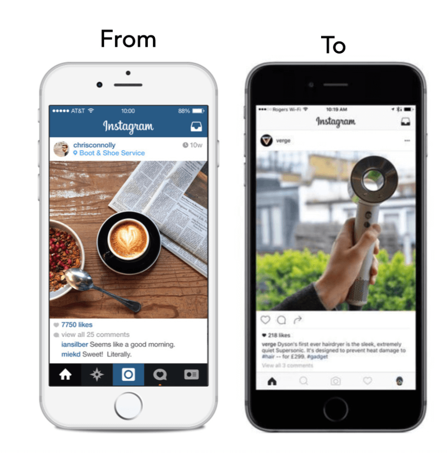
And with that, one of the biggest redesigns of 2016 was born. Here’s a before-and-after look at Instagram’s home screen:

When describing the effort, the head of design at Instagram wrote:
We stripped the color and noise from surfaces where people’s content should take center stage, and boosted color on other surfaces like sign up flows and home screens.
During this part of the process, don’t reject the idea of tweaking colors, playing with layouts and other forms of experimentation. Of course, you never want to make changes just for the sake of making changes, but don’t be afraid to go outside your comfort zone and bring all these efforts to the table when it’s time for an internal review.
Step 5: Communicate & Test Your Redesign With Users
Now that you have created a few variations of the redesign, it’s time to get feedback from people outside the organization. Ideally, you’ll capitalize on an existing user base and use their feedback to gain insight into which areas of your app need further refinement.
Conducting this form of early research is all about receiving raw and authentic feedback. It’s possible you hear things that counter your own beliefs about the app—that’s OK. Gaining this perspective will improve your chances of launching something that doesn’t cause a brand armageddon.
Step 6: Monitor Usage & User Response Upon Launch
After months of research, iteration, design and development, it’s finally time to launch. You want to ensure that the rollout of this updated version of your app comes with all the right communication efforts, from PR to online marketing. You’ll also want to share the story behind the redesign shortly after you publish the new-and-improved app.
As time goes on, the feedback and usage data will start trickling in. Just as you used feedback to reach this redesign, you should review the new data on a regular basis to ensure that you’re achieving the redesigns initial goal.
It all goes back to the why.
To find out if the redesign was successful, look back at the goal you set out when you first started this project and gauge whether you achieved it. Did usage increase? Did engagement increase? Are there more positive reviews in the app store than there were before? Are you seeing a spike in growth?
That’s where you need to focus your attention now. Use your data and feedback as a starting point to not only gauge whether the redesign was a success but also to uncover opportunities to iterate and improve.
Wrapping Things Up
The process of a mobile app redesign can seem overwhelming at first, but by following these steps, you can make sure all the work is well worth it. You can achieve your goals and give your users a better experience for months (maybe years) to come.
If you’re interested in conducting a mobile app redesign, we’d love to chat. Our team has helped companies of all shapes and sizes improve their apps, and we’d love to show you what our process is like. Get in touch!


