Did you know that 88% of online consumers are less likely to return to a website after a bad user experience?
As new apps continue to be created, the market has become increasingly competitive, forcing app-makers to roll out more innovative features. Incorporating new technology is important, but the apps offering the best user experience with that technology are the ones that will come out on top.
Healthcare apps aim to transform the delivery of care. These apps are great tools for physicians, but it’s the patients who reap the most rewards.
In healthcare, a bad user experience and clunky design could have serious implications for the quality of care patients receive—and we suspect that might be one reason for the slower-than-desired adoption of healthcare apps. But thanks to innovation in AI and creativity on the part of mobile app designers, the user experience is seriously improving.
Recently, this growth has led to the establishment of a new kind of UX—healthcare UX. I And so, we at Mindsea wanted to explore how healthcare UX is helping everyone receive better care.
Here are four prime examples of how better healthcare UX is improving the patient experience:
Communicating Information More Effectively
UX is all about the user—in this case, the patient. When seeking medical intervention, we’re not always functioning at our best. This makes effective and intuitive UX design even more critical.
There are some UX considerations unique to health that can make the app experience simpler and more effective. One of these considerations is language. In order for a health app to be effective, the user not only has to navigate the app successfully, but also understand the information being delivered. That means apps need to stick to colloquial terms and avoid unnecessary medical jargon.

Language in healthcare UX also plays a role in keeping a patient’s stress at bay. Sometimes scientific terms can give the impression that a condition or diagnosis is much more severe than it actually is. Using common terms instead of their medical counterparts helps to communicate effectively and alleviate unnecessary stress.
Presenting information in order of relevance and severity also achieves this goal. Seeing a list of all the possible diagnoses based on your set of symptoms can do more harm than good. If the app doesn’t define how high the risk is for each diagnosis, then the patient is left to stew in their worries and what ifs. Use terms like “likely” and “unlikely” to help the user determine how much attention they should pay to each potential diagnosis.
Visuals, too, can help a patient understand what apps are trying to communicate. There is a whole industry established just for naming prescription drugs—and just because their names are rooted in science doesn’t make them easy to remember.
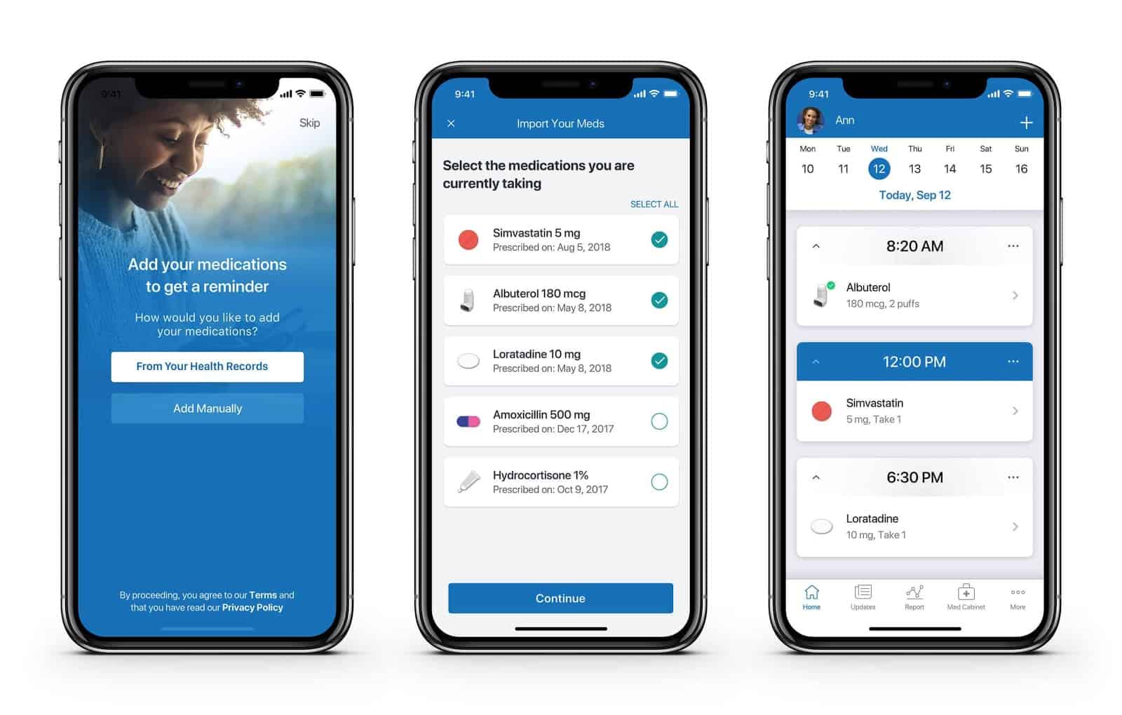
To make up for this, mhealth apps have started strategically using images. Imagery can help users make critical mental connections to a drug by illustrating the pill colour, the dosage, or how to take the medication.

Using simple language and strategic imagery can make a world of a difference in helping patients. These basic healthcare UX improvements enable patients to feel comfortable and confident using healthcare apps.
Personalizing Healthcare Delivery
Many of us are no strangers to the practice of Googling our own symptoms only to find out that what we thought was a morning headache could possibly be terminal.
To combat the dangers of self-diagnosis, many healthcare apps aim to be informational resources for their users—but doing so effectively involves personalizing the experience.
In the early days of healthtech, many apps simply took the information they already offered on the web and delivered it via mobile. Today, integrations with AI and machine learning use individual patient data to customize each user’s experience.
Newer mhealth apps have the option for patients to input their medical history and can even provide access to the health metrics that their phone is already tracking (e.g., steps, runs, heart rate, etc.). Apps then use algorithms and machine learning to decipher what information is relevant to the user.
These advancements in technology better predict a user’s habits so that apps can deliver helpful recommendations.
This shift towards personalization not only makes apps more effective, but it serves to provide better care. Everyone’s healthcare needs are unique, so improving the personalization of care delivery means addressing the needs of the entire population.
Protecting Patients’ Information
Working in healthcare means adhering to strict regulations because of the severity and sensitivity of the information involved. There’s little room for flexibility as far as privacy and security guidelines are concerned.

Complying with regulations like HIPAA (or the Canadian equivalent, PIPEDA) is a major consideration when designing and building a healthcare app. Regulations govern what information can be shared and with whom, and they can be particularly problematic when apps need to communicate with patients; for example, information that can be shared via email is more limited than in other industries. The challenge then for app owners, designers and developers is to deliver messages per these guidelines while still providing a pleasant experience.
One way to accomplish this is by relying on familiar user journeys. By improving on the UX that already exists, rather than introducing entirely new experiences, you’ll ensure that the app is still instinctive for the user.
Better UX in healthcare involves innovation and creativity in the delivery of the experience users expect while always adhering to guidelines to keep a user’s information safe. This creativity comes in the form of being able to communicate the same message, in an accessible way, using simple workflows and adhering to regulations through UX design. This is done through reducing distractions within the app, minimizing supply chains/processes and establishing connections with the user.
Making Healthcare More Accessible Than Ever
When developing an mhealth app, one vital part of the user experience is accessibility.
We can’t overlook the fact that in today’s COVID-19 environment, walking into a clinic is more difficult than ever. For many people, whether for health reasons or because they live in a remote area, seeing a provider in person isn’t an option right now. A mobile app means users can access care whenever and wherever they need. And seamless UX makes users who may be new to the technology more willing to learn and adopt it.
One feature that many apps have begun incorporating in order to foster a sense of familiarity is an AI chatbot. Any semblance of human connection can make a user feel more comfortable seeking healthcare via mobile, and chatbots provide this by simulating the interaction between a patient and a medical professional.

Besides, many people are already familiar with chatbots, which are not unlike your average messaging app. Such a widely known feature makes it easier for a user to navigate the app and all its functions.
Technological advancements like chatbots are great, but they’re virtually useless if a user can’t see clearly.
Over 1.5 million Canadians identify as having vision loss. In the United States, that number is a whopping 26.9 million (or about 10%) of the population. That’s over 28 million people in North America alone.
The needs of these patients should be considered during any new app build. Factors like colour, button size, shadows, font type, and font size all help or hinder these users’ ability to navigate an app.
Functionality precedes branding when it comes to design, but the real creativity lies in bringing together brand, functionality and simplicity. This is imperative for improving healthcare UX.
Conclusion
A well-designed health app is a catalyst for a healthier tomorrow.
Using apps before, during, after or instead of in-person visits helps patients stay informed and healthier in the long run. Empowering patients to make use of these tools gives them more personalized access to care, and leads to fewer clinic visits and better health overall.
That’s why the evolution of healthcare UX will be patient-led. App developers and designers are tasked with innovating not only to remain competitive, but to improve lives and create a healthier future.
Looking to build an app in the health space? Reach out and chat with one of our product strategists to see if MindSea is the right partner for your mobile health solution.


