If you’ve ever wondered…
What color should my app icon be?
Does the color of an app logo have any influence on downloads?
What primary color should I use for my mobile app?
How do users respond to different color schemes in an app?
…then this guide will help you find the answers once and for all. In this article, we’ll dive into proprietary MindSea research along with research from some of the world’s top universities to equip you with everything you need to know about color theory and its role in app design.
With the constant chatter in the design world today about design trends and the user experience, it’s easy to forget one of the simplest yet most important elements of design: color.
You might think I’m being a bit overdramatic when I say this, but color schemes are at the heart of quality design. Whether we’re talking about gray used to suggest shadows or bright red to highlight errors, color has always played a role in great visual design and how we interact with digital interfaces.
People love color.
People connect with color.
Colors can shape our perceptions.
And color can make the difference between a quality mobile app experience and one that is mediocre at best.
Understand The Role Color Plays In Your User’s Life Experiences
Identifying the appropriate color combination is one of the most important (yet overlooked) elements of creating a high quality mobile app. The color choice should be carefully thought out, from the logo and app icon to the buttons and navigation elements that make up the app’s interface.
In a study conducted by the University of Winnipeg, researchers found that between 62 percent and 90 percent of our snap judgments about products are based on color alone. As such, it’s important that app designers understand the significant role that color can play in determining whether someone decides to download their mobile app.
One of the first brand interactions that a consumer has with a mobile app happens in the app store. Usually, that experience starts with the app icon. In 2017, our research team decided to study the app icons of more than 300 apps from a variety of categories to better understand app icon design and how to create icons that are more likely to convert into downloads.
One of the insights we gained through this research was that blue is the most popular color for icons in the app store. Think about some of the most popular app icons—Google Calendar, Apple App Store, Safari, Shazam, Twitter, LinkedIn, Facebook. The color blue is found in every category and every industry.
While blue was popular in most categories, amongst Food & Drink apps, the primary color was red. As Business Insider points out in their article “Most of the top food apps are red, but the reason has little to do with science,” using the color red to inspire hunger isn’t backed by as much science as you would think. In a study published in the journal Appetite, the conclusion was actually that red reduces rather than increases the likelihood of eating:
![]()
Based on evidence that the color red elicits avoidance motivation across contexts, two studies investigated the effect of the color red on snack food and soft drink consumption. In line with our hypothesis, participants drank less from a red labeled cup than from a blue labeled cup (Study 1), and ate less snack food from a red plate than from a blue or white plate (Study 2). The results suggest that red functions as a subtle stop signal that works outside of focused awareness and thereby reduces incidental food and drink intake.
Keeping this conclusion in mind, it’s important to note that the sample size was only 41 for the soft drink portion and 130 for the food portion. In many ways, the psychology and theory behind colors and their influence on decision-making are still to be discovered and understood. In fact, a quick Google search for “color meanings chart” will serve up a handful of graphs showing different meanings for all the colors of the rainbow:
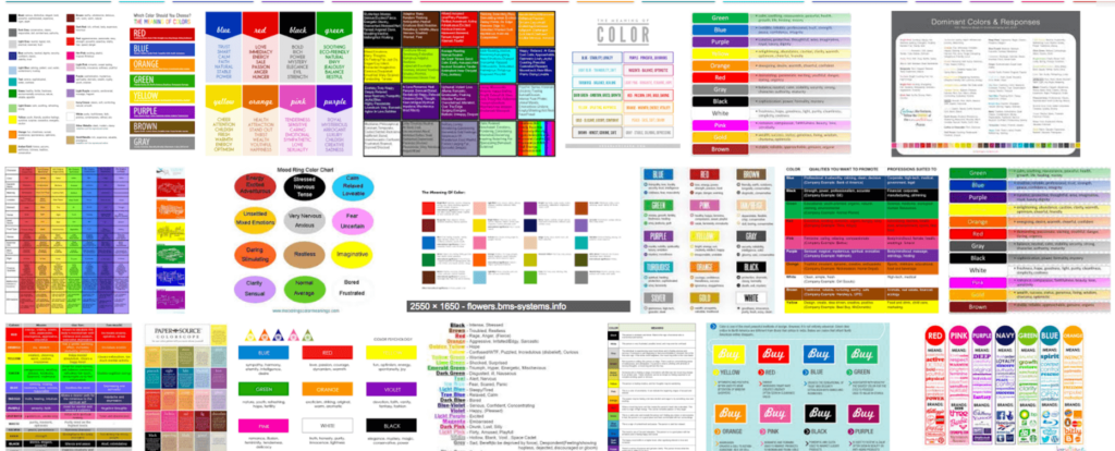
A great summary of the way we like to think about color comes from the author Winifred Gallagher: “Anyone who has ever felt blue, seen red, blacked out, or turned green knows we’re prone to make emotional associations with different shades.”
The connection between colors and feelings is probably the simplest way to think about your app design. Studies have shown that past experiences guide our reality. If we’ve had relaxing experiences by the ocean (blue) then we’re more likely to associate the feeling of relaxation with that color. Similarly, if we’ve eaten lots of food from brands with red logos like these…
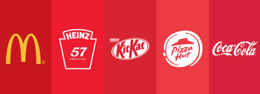
…then it’s very possible that over time we’ve established an association between feelings of hunger and the color red. Of course, science has just started to scratch the surface of color, but this simple framework can work well in the planning of your app’s color scheme.
Ask yourself the following three questions:
- What colors do the majority of the apps in our category use?
- What colors would people associate with other solutions to this problem?
- What colors would lead to a negative perception of our solution?
Once you’ve answered these questions, you’re instantly armed with a better idea of what colors you should embrace. Here’s one of the best charts we’ve come across about color schemes and popular associations:
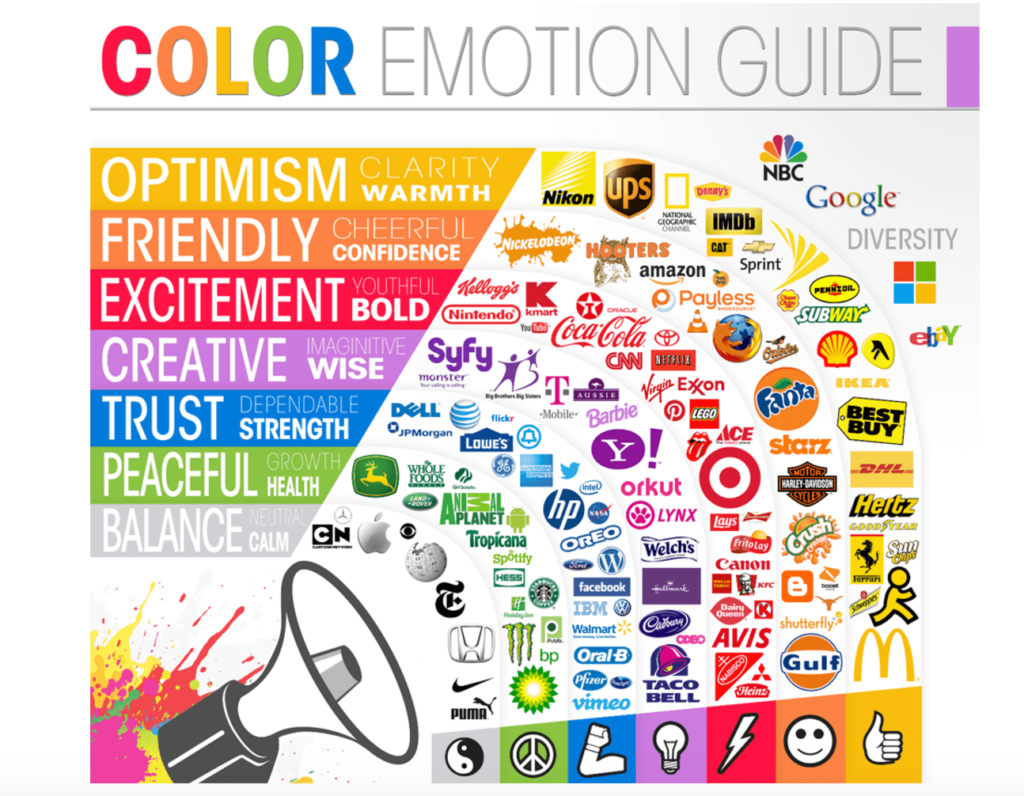 (Source)
How To Pick The Right Color Scheme For Your Mobile App
Once you have a foundational understanding of your industry, the app category and your users’ preferences, it’s time to find a color scheme that helps create a great experience. Color schemes are one of the most fluid elements of mobile app design, and the best practices and trends that designers should embrace change quite frequently.
A study conducted at the University of Toronto found that most people prefer simple color combinations that rely on only two to three colors. While you may feel inspired to add a variety of colors to your mobile app, it’s best to find one primary color plus a few others that complement it in a way that aligns with the look and feel you’re trying to achieve.
A great starting point is a color wheel:
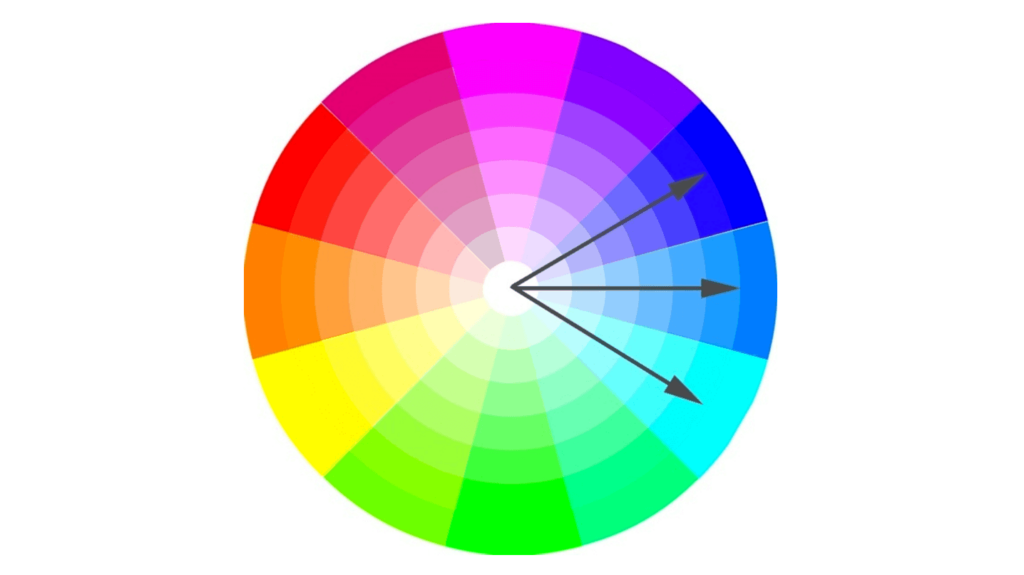
The color wheel is a visual template that for years has helped designers better identify the colors that should make up their work. It’s a great tool for choosing a color scheme, and in many ways, it makes understanding color schemes a lot easier.
Recognizing that most people prefer palettes with fewer colors, some designers are looking to the monochromatic color scheme. The idea behind a monochromatic color scheme is to focus on a single color and then go deep by using its tones, shades and tints, as indicated by the arrows in the color wheel above.
The folks at Canva put together a great visual representation of a monochromatic palette with this nifty visual for a turquoise hue:
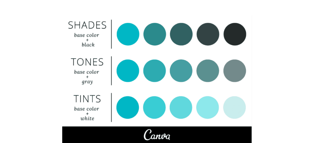
While monochromatic color schemes are becoming very trendy amongst app designers, there are plenty of multi-color schemes to pick from too. The color wheels below show you some of the strategies for creating a cohesive color scheme for your app:
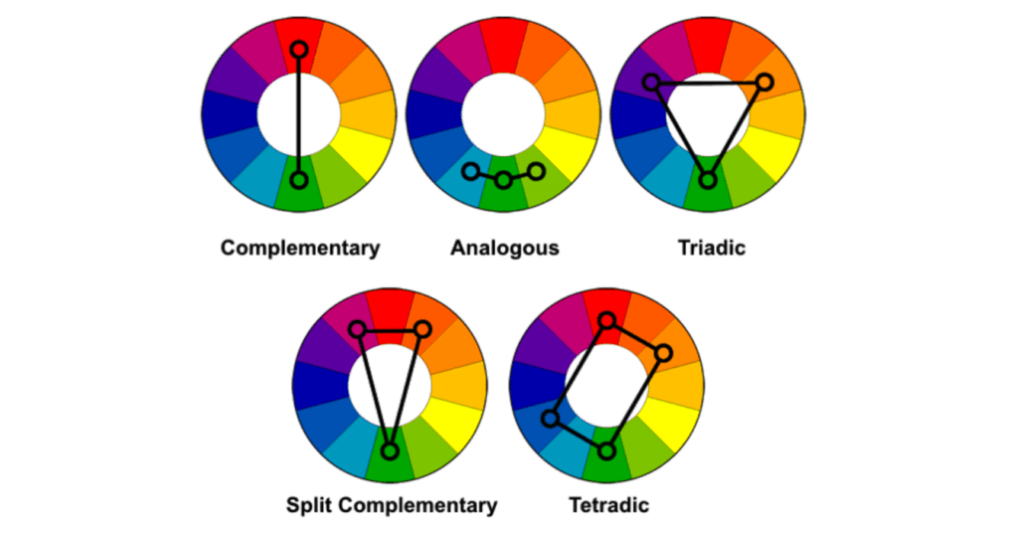
It’s these different combinations of colors that are considered by most designers to be the most aesthetically pleasing. As trends change, the preferences of the different schemes change as well but this graph is a great starting point for picking a scheme.
Once you’ve identified the appropriate color scheme for your mobile app, it’s time to start injecting those colors into your interface. At the end of the day, creating a mobile app with a user-friendly interface that can be navigated seamlessly is equally important as the colors.
You can have all the right colors, but if your users are struggling to do what they sought out to achieve, your app is likely to be uninstalled faster than you can imagine. That’s why it’s so important to spend some time understanding user experience design as a whole before creating a mobile app.
