Did you know that the Starbucks logo has changed multiple times since launch?
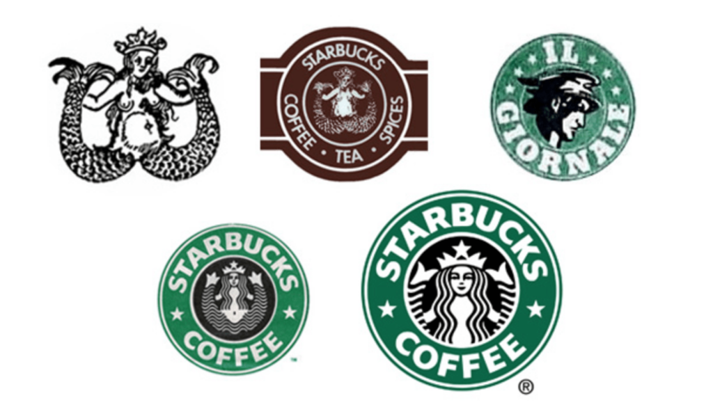
It’s the natural evolution of design—because what makes a design beautiful in one generation makes it out-of-date in the next.
That’s why brands invest in redesigning their logos, websites and mobile apps. As their users begin to embrace a new wave of design and cultural aesthetic, brands must adapt. And when it comes to mobile, brands also have to adapt to new technologies, screen sizes and functionality.
Think for a moment about what that means.
An app idea that is great today won’t last forever. It must be maintained. The look must be kept up to date. Four years from now, the visuals and user experience that you develop today will likely be irrelevant, or will no longer offer a stellar experience.
That’s why an app redesign must be considered with care.
You can’t jump into the redesign of an application that people once loved without being properly equipped. Whether you’re redesigning an Android or iOS app, these are the questions you need to know the answers to before you take the plunge.
Question 1: What Are The Goals Of The Redesign?
One of the biggest mistakes that brands with extra room in the budget make is doing a redesign for the sake of doing a redesign.
You need to start the redesign process by identifying a goal. What do you want to accomplish once the redesign is complete? Do you want to see usage increase? Are you trying to enhance the overall user experience? Do you want to optimize your conversion funnel?
Start by understanding the why behind the redesign.
Once you know the goal, you can start thinking about the tactical efforts that will help you accomplish it. But before you start designing mock-ups and identifying the perfect onboarding experience, you need to invest in research.
Question 2: What Do Users Think Of The App Today?
When you’re about to redesign an app, you need to keep your users front of mind. A redesign can go one of two ways:
The existing users love it right away and engagement goes up…
…or they’re completely confused by the redesign and revolt.
When the revolt happens, it’s typically because someone on the redesign team overlooked the research and data-gathering stage in the process.
But when users love the new design, the success is usually due to four key efforts:
Review Trends & Competitive Apps
One of the first things you want to do is identify why you’re doing the redesign.
Are there recent trends in design that are pushing this move?
Are there recent trends showing that aspects of your app are no longer valuable?
These are things you need to understand before taking the leap into a redesign. You want to clearly understand what elements of your app are outdated or have stood the test of time.
Spend time testing other apps to understand where your app sits in comparison. Can you take inspiration from apps that are serving different needs or industries? Can you use other apps as inspiration to better understand what people want from a mobile experience in the existing landscape?
Reading Customer Reviews
Customer reviews in the app store can offer an untainted perspective of what users think. While most apps use push notifications after key actions to drive positive reviews, negative reviews can actually offer greater insight.
Here’s a look at the reviews for one of the most popular mobile apps in the world, Candy Crush:
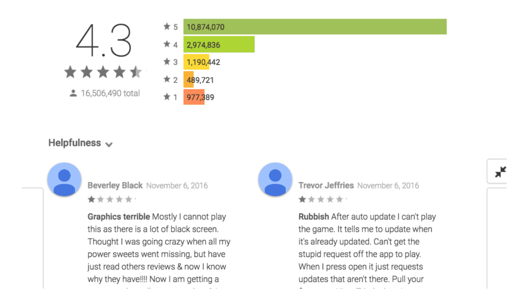
That’s right—even Candy Crush gets bad reviews.
The first review expresses frustration that “there is a lot of black screen.” The best app teams would continue to sift through the reviews to see if this is a one-off scenario or if this complaint seems to be a trend among users. If it’s a trend, the problem would obviously become a priority in the redesign as something that needs to be addressed.
Use Interviews & Analytics To Gain Insight
If your existing mobile app leverages an analytics service, these analytics are a gold mine for insight. You can use this data to have an unbiased look at how people are using your app on a regular basis. You can use this data to know what features really matter and which features haven’t been touched in months. Of course, you need to be smart about your interpretation of the data.
One of the best ways to gauge some of your conclusions based on data is to compare it with qualitative insight from interviews. User interviews can be conducted in-app, via email or over the phone. The goal of these interviews is to gather qualitative insight from users about their key objectives when using the app, along with the things they like and dislike.
Here are a few questions worth asking:
- What features do you use on [Your App]?
- What do you find the most frustrating about [Your App]?
- What do you like best about [Your App]?
- Which features could you not live without?
- Which features could you live without?
- If you could change one thing about [Your App], what would it be?
- What else would you like us to know about your experience with [Your App]?
Now it’s time to take the answers to these questions and use them to uncover insights.
Question 3: Which Existing Features Are Priorities?
When you open Snapchat for the first time, the app immediately takes you to the camera.
The camera is their priority—they want people to take photos or videos first and foremost.
Facebook, on the other hand, has two priorities: (1) User-generated content and (2) the act of consuming that content. That’s why in the initial frame on the Facebook app you will be see both a call to action asking you to write “What’s on your mind?” and a glimpse of what some of your connections are up to.
It’s easy to get caught in the trap of saying, “Everything is important. Just find a way to make it work”
But prioritizing features based on user research and organizational objectives is an important part of the redesign process. It’s reality that some features are just more important than others.
One of the best charts I’ve come across for feature prioritization comes from the team at Intercom:
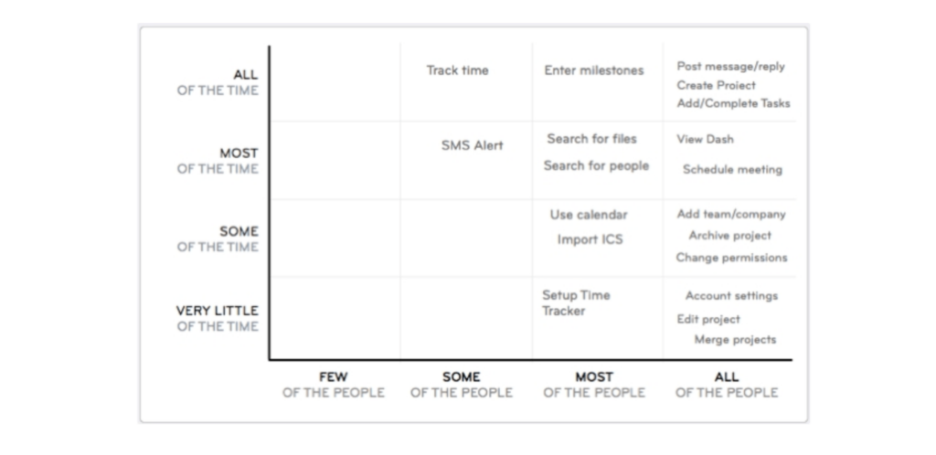
The chart combines how many users will be using the feature with how often they’ll use it. This approach gives you a sense of where the value is in a clear, visual way—any features that fall in the upper right quadrant should clearly take priority.
Before moving forward with your redesign, create a chart like this for your app so you have a clear idea of which features actually matter to your users.
Question 4: Do You Have Established Brand Guidelines?
In marketing, the word brand is both overused and misused. Often.
Frequently, people think that a “brand” is just a logo and color scheme. In reality, a brand is much more than that. It’s the feeling you get when you open an app. It’s the tone of the copy on a landing page. It’s the visual cues. And it’s the story that your users spread when they discuss your app or product.
No matter how big or small your company is, it’s important that everyone is on the same page. That’s why brand guidelines are so important.
A brand guideline is a manual that showcases the brand identity, the story behind it, color schemes, tone and all the key elements that should be used in brand materials.
If you don’t have brand guidelines, that’s perfectly fine. You can use existing materials and channels to get a sense of what that should look like and use it to guide the redesign. It’s very important for any brand to establish a set of brand principles and guidelines before diving into a redesign.
Here’s a portion of a brand guideline that we created in collaboration with the team at Glue:
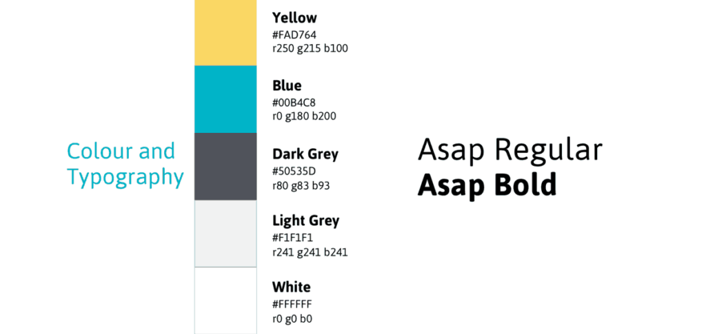
Creating guidelines like this arms you with the knowledge of how the app should look and feel. During a redesign, this is important information to know—you don’t want to be surprised when your app team starts changing your color scheme.
Wrapping Up
Ready to start your app redesign?
Before jumping in, make sure you’ve taken the above questions into account.
It’s easy to want to take a shortcut, but shortcuts can lead to scope creep, a poor experience and a redesign that goes south. Unfortunately, a bad redesign usually leads to another redesign to fix all the issues. Instead, remember these tips as you move forward, and your mobile app will be all the better for it.
Interested in some hands-on assistance with a redesign? Get in touch and a member of our mobile app development team would be happy to talk with you about how we’ve helped other companies make the transition.
