Case Study: PSYCHSCOPE
Help people understand and
battle depression

What do you get when you pair two Canadian psychiatrists passionate about mental illness with one Canadian app development agency passionate about bringing new and innovative visions to life? You get PsychScope!
PsychScope is an app designed to help youth dealing with depression better manage their mental illness. Through missions and friendly reminders, the user is taught new coping strategies, encouraged to track their mood and sleep patterns, and is able to involve their personal circle of supporters through their check-ins with the app.
PsychScope is the ultimate digital self-care app.
The journey to launch
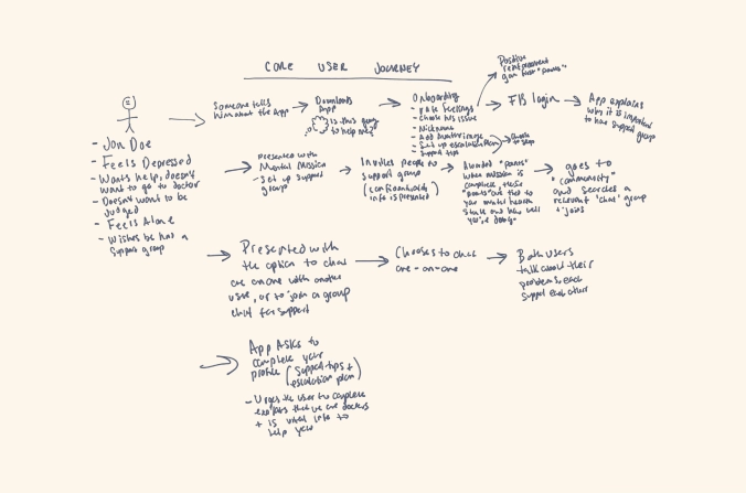
When the PsychScope team approached us, they already had a rough plan for their app, but really wanted to take things to the next level in order to serve their users better. So we sat down with them to help chart out a detailed plan for the app using our Mobile App Blueprint process.
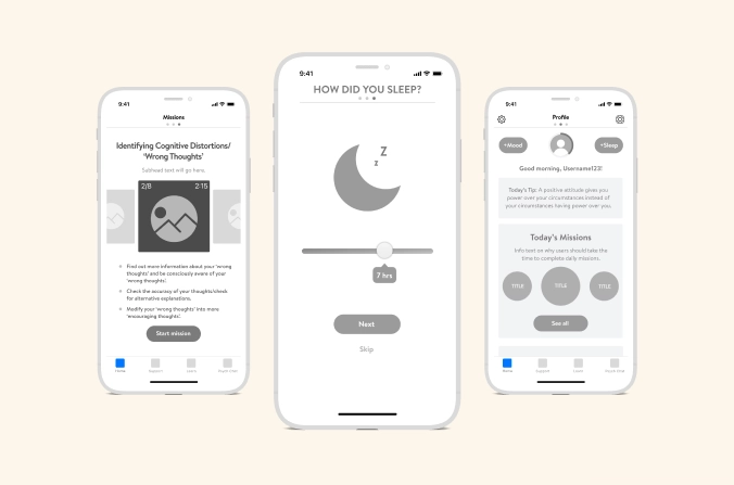
The Mobile App Blueprint is an immersive and collaborative process where we better understand our clients’ user base and product vision. This is where we start to map out everything, from wireframes and user flows, to mock ups and designs.
Building an app catered to mental health
In mHealth, we often deal with sensitive and private information. Thus, it was important that we started this project with the appropriate protocols and security measures in place to create a safe forum for self-expression. Some of the efforts included:
Establishing profile security
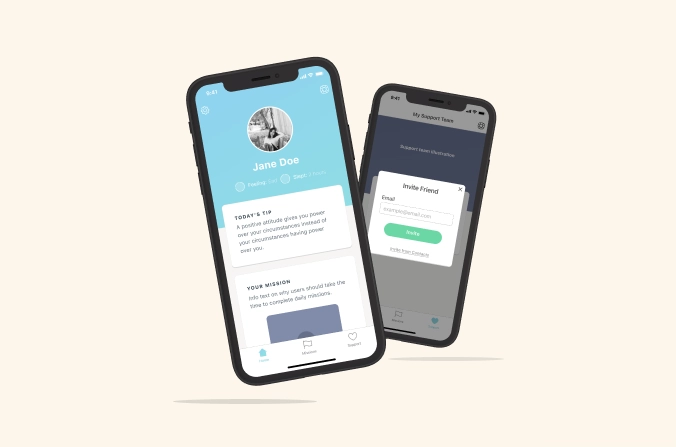
We wanted to ensure the user had ultimate say over who their information was displayed to. The end result is that someone can only join your support team if you invite them to join.
Using appropriate language
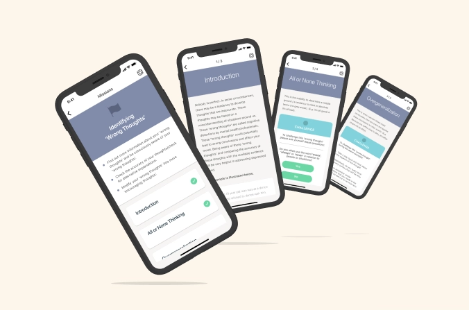
We wanted to make sure we were sensitive to those dealing with mental health and, as such, made sure to avoid any triggering words throughout the app.
Launching with simplicity
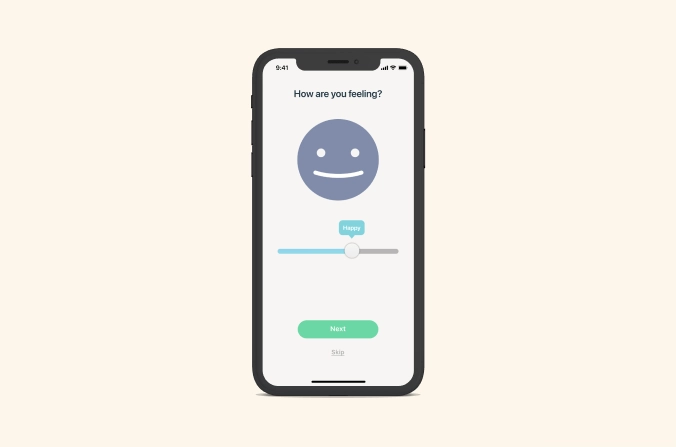
Deciding on which features to launch in the first iteration of an app, is a common conversation during any build. An even greater consideration, due to the topic matter of this particular app, was the possibility of having too many features that would overwhelm a new user. That said, we needed to keep our first launch simple and easy to use.
Keeping things interesting
While launching with an MVP typically makes the most practical sense for any new app, it’s equally important that there’s still enough excitement built in to keep the user coming back for more.
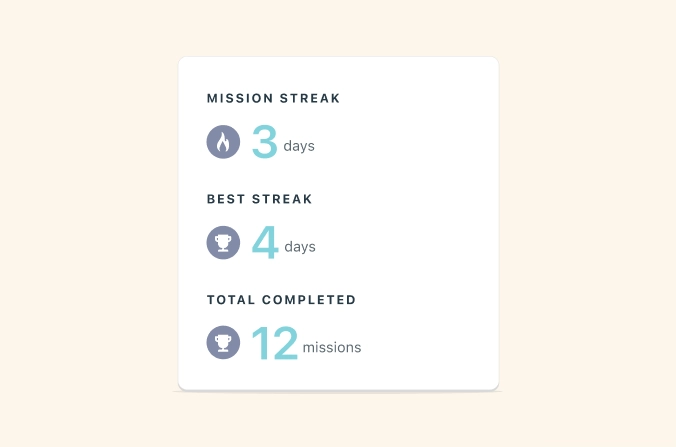
This is where the idea for Mental Missions came in. Each day, when the user opens the app, they are met with positive, reinforcing messages on their dashboard. They are also encouraged to learn something new about depression – by reading something or answering questions – and are reminded to track their mood and sleep each day.
These features not only help spark continual interest, but the required touchpoints do a great job at keeping folks engaged.
A happy app icon to tie it all together
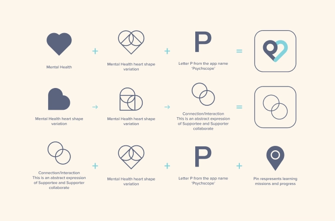
There’s no better symbol of understanding and compassion than a heart!
This is where the idea behind the PsychScope app icon began. The two sides of the heart symbolizes the user, or the “Supportee”, coming together with their friend/family member, the “Supporter”, in an effort to build a greater understanding of the challenges of depression and work together to combat those challenges.
Ready to build an app that improves lives?
Find out how MindSea can help you reach your goals.