Case Study: BLUE CHARM ADHERENCE
Designing a multi-national compliant health application to help enhance patient outcomes – with room to grow

What happens when a patient takes medication home with them? Do they adhere to the instructions they have been provided by their healthcare provider? Often, aspects of medication non-adherence are unintentional. So, how do healthcare providers know if the medications are being taken correctly, if at all? This and other patient behaviours are out-of-sight to the doctors who prescribe them, as well as the manufacturers that make them. Medication adherence is a complex topic and challenges to adherence surrounding instructions for taking prescription medications have been around for centuries. Sackett (1979) notes that even Hippocrates knew that patients often pretended to take their medicines.
Within chronic diseases, medication adherence has unlimited complexities and contributes to poorer health outcomes of intended treatments. Is there a way to increase visibility so stakeholders can track how, where, or when medications are being prescribed, and if patients are taking them as designed and, if they are getting expected outcomes?
Blue Charm Adherence is a Halifax-based healthcare company that specializes in medication adherence, health learning, and patient engagement advocacy. They needed to build a highly flexible interactive patient platform that personalized education and medication reminders in an effort to track, manage and help improve outcomes for patients with diseases requiring specialty medications.

The ask:
Blue Charm Adherence came to MindSea seeking to build a mobile app and supporting systems that would drive individualized engagement for medication adherence in Canada and the U.S.
The challenge:
Design a product and business in a highly regulated environment that allows for near infinite flexibility to adapt from individual patient, client, and business learnings.
The goal:
Enhance transparencies between all stakeholders, while finding ways to incentivize patient engagement which would lead to improvements to adherence to prescription medications and ultimately help optimize health outcomes.

Uncovering Insights to Create a Meaningful Solution
The steps below reveal how we approached this unique assignment in partnership with Blue Charm Adherence. As with every project, our discovery phase helped uncover key stakeholder insights, needs, and additional questions around how to best comply with security and privacy guidelines.
1. Understand the need:
Our first step was perhaps the most important one. We needed to learn everything we could about the space, origins of the founders, the current status quo, competitive strategies, regulatory trends, and those who would be using this product (and why they need it). We aligned with Blue Charm on not only what their needs were, but other stakeholder needs as well.
2. Define product and priorities:
As we were able to discover what our main goals were, both from a technological standpoint and also from a business-needs perspective, it became obvious that we’d be tapping into a vast amount of information and utilizing such data to communicate between patients, providers, and manufacturers. Knowing we wouldn’t solve every need all at once, we discovered the most straightforward approach would be to coordinate with drug manufacturers, tap into their knowledge and need base, and ultimately help improve patient outcomes. From there, we set out to build a product hypothesis that would communicate the true value of this product, both internally and with real-world use.
3. Proof of concepts:
In collaboration with Blue Charm, several proof of concept (POC) projects were undertaken to verify technical and business viability. These included:
Systems POC – a validation that the recommended server technology and required technical integrations would support scaling, reporting, flexibility, and security requirements.
Business POC – an investigation into the viability in which sample client requirements were implemented via Monte Carlo simulation to look at needed engagement personas and volumes to ensure program and product success.
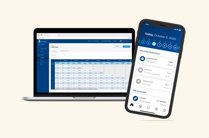
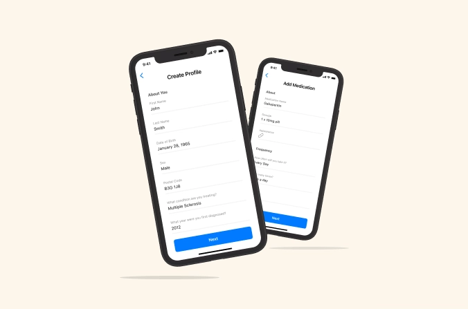
Design POC – the creation of sample UI/UX screens and workflows to ensure ease of onboarding, enrolment, engagement, and redemption within the app.
4. Incentivize adherence:
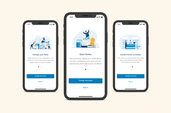
In collaborating with drug manufacturers, we were able to identify a primary benefit for patients using the app – savings on future healthcare expenses. How could the app provide savings to patients, though? Well, if a patient were to log their daily medicine intake according to provider instructions, a program sponsor could reward their good behaviour with a point-based system that translated to future funding of healthcare related services associated with their disease. So, a key tech feature to the app would involve creating the ability for program sponsors to track points based on the user’s level of participation, assign funding into user accounts, so when they go to purchase disease related healthcare services they can simply utilize those funds available.
This approach fit in nicely with Blue Charm Adherence’s overarching aim to offer funding for health-related services that complement the patient treatment journey.
5. Design deep-dive:
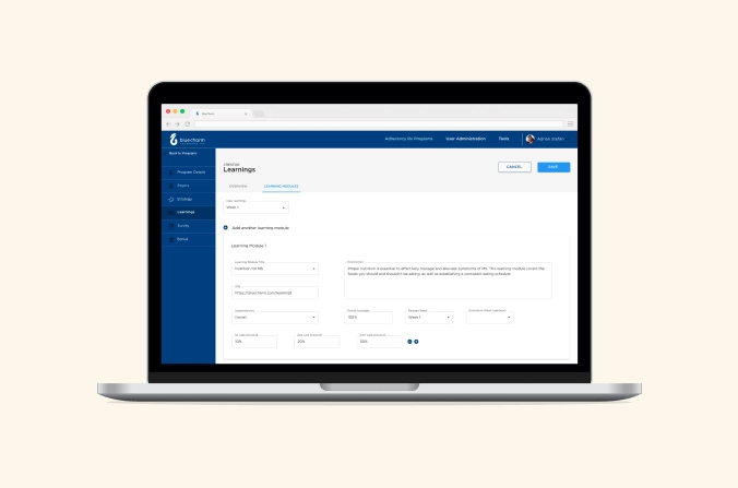
We were excited to start creating mock-ups and wireframes within the constraints outlined above. We ended up creating a clickable prototype where users could access a diverse set of data parameters. At the same time, we began working on building an Excel-based model to demonstrate the different ‘levers and knobs’ that could be used to configure unique programs and the associated engagements and incentives that go along with them. We wanted to have an answer for all the possible paths a patient, provider, or manufacturer might take within the app:
- Would a patient be willing to provide certain personal information?
- Is a patient eligible to participate in specific programs?
- Would a manufacturer be able to provide cost savings to patients in a certain region?
- What are the privacy and security guidelines within each province, state or region?
- Could we push or pull all relevant prescription data, instruction, and costs?

Ultimately, Blue Charm Adherence decided against building a complex proof of concept due to time constraints. Instead, we designed a comprehensive event sourcing platform, which treats every act a user performs in the app as an event. All of these events are then encrypted and stored in particular regions, based on our users’ privacy needs and concerns. This approach enabled us to break down all the potential patient program scenarios and information exchanges for easy access.
6. Build a user-centered design, with room to grow:
In collaborating with Blue Charm Adherence, we realized the app needed to have flexibility in its design and its ability to curate learning and track reminders in real-time. This would enable stakeholders to visualize what good user behaviour looks like – and act accordingly and immediately. So, we compiled an exhaustive list of “what if” scenarios based on how current and future users may engage with the product.
Knowing a program’s parameters of privacy measures could change at any moment during the design build, it was critical that we left open the possibility to reconfigure user features to better match real-life needs, such as:
- Tracking treatment changes
- Changes to insurance policies
- Collection of outcomes and feedback
- Enabling reports to be sent to program suppliers sponsors and manufacturers
- Updating user privacy

7. Train the team:
We culminated our collaborative effort with Blue Charm Adherence by helping to train and transfer knowledge to their development team. This involved providing a complete download of the product build history as well as full training of our design best practices.
8. Ongoing support and continuous improvement:
We’re still partnering with the team by providing support when new market dynamics and product learnings offer the opportunity to revisit features or functionality that may enhance the user experience.
Flexible, secure, and scalable. That’s how we describe the app design we created in collaboration with Blue Charm Adherence. We were thrilled to be a part of such a unique workstream and continue to support Blue Charm Adherence with their continuous improvement journey.
“MindSea helped provide an environment whereby Blue Charm could transform innovative ideas into practical solutions for patients with chronic disease. Their process made it easy for us to focus on what the market needed by delivering best in class technology and app development.”
–Greg Patey, CEO, Blue Charm

Ready to build an app that improves lives?
Find out how MindSea can help you reach your goals.